


Hello! I took on this brief by Victoria Stefania because I loved the concept. Being my first branding project in a while, this helped me get back into that groove and also learn new things about presenting a brand. It also helped me really hone in on my own branding process, which I will detail below.
The Process
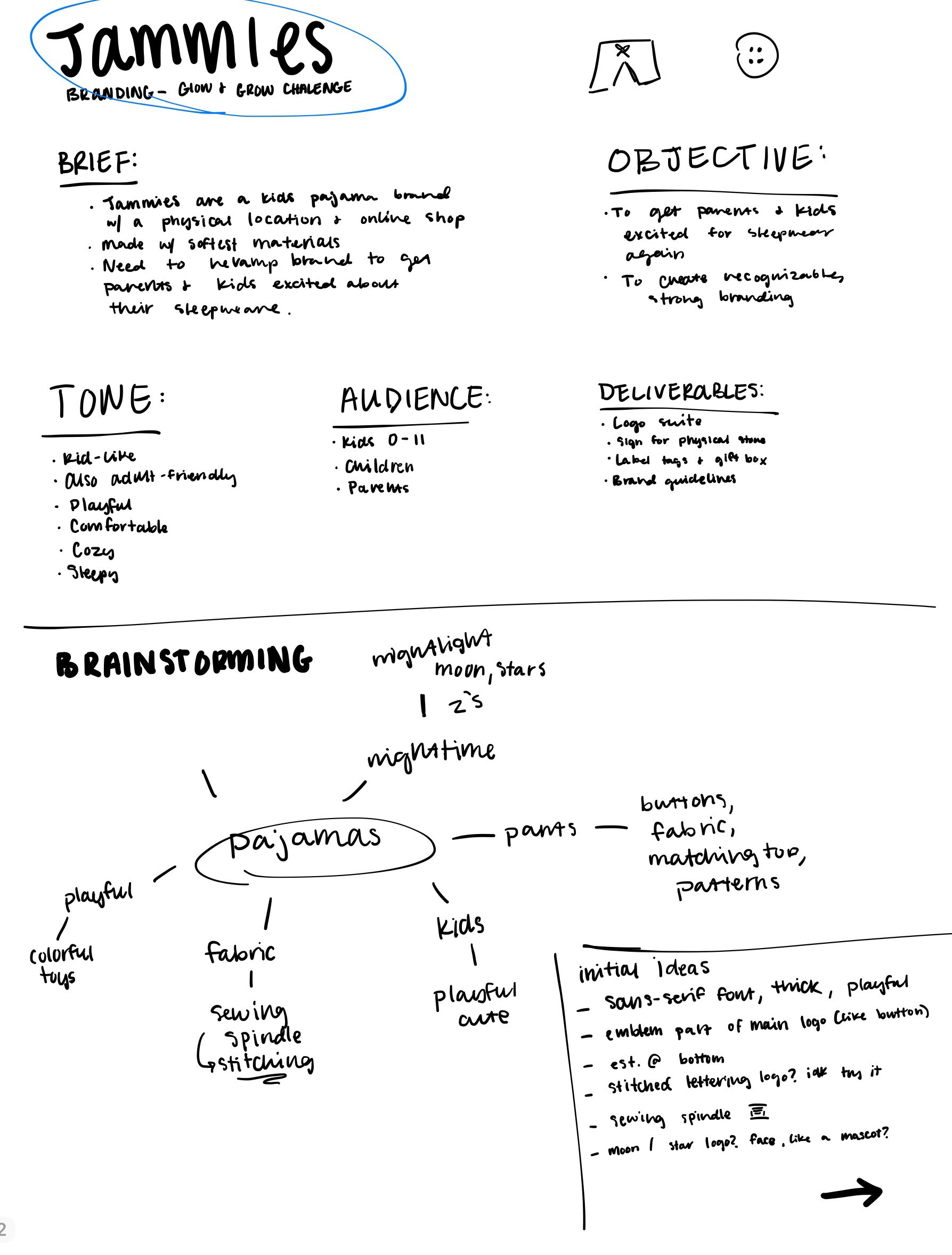
1. Understanding the Brief
The very first step in my process is to make sure I fully understand the brief and what problems need to be addressed. This brand's brief is as follows:
"Jammies is a kids' pajama brand with a lovely physical store, and also an online shop to be more accessible for busy parents. Their pajamas are made with the softest quality fabrics to ensure a comfy night's sleep for the kiddos. Now they need to revamp their branding to get parents and kids excited about their pajamas and sleepwear."
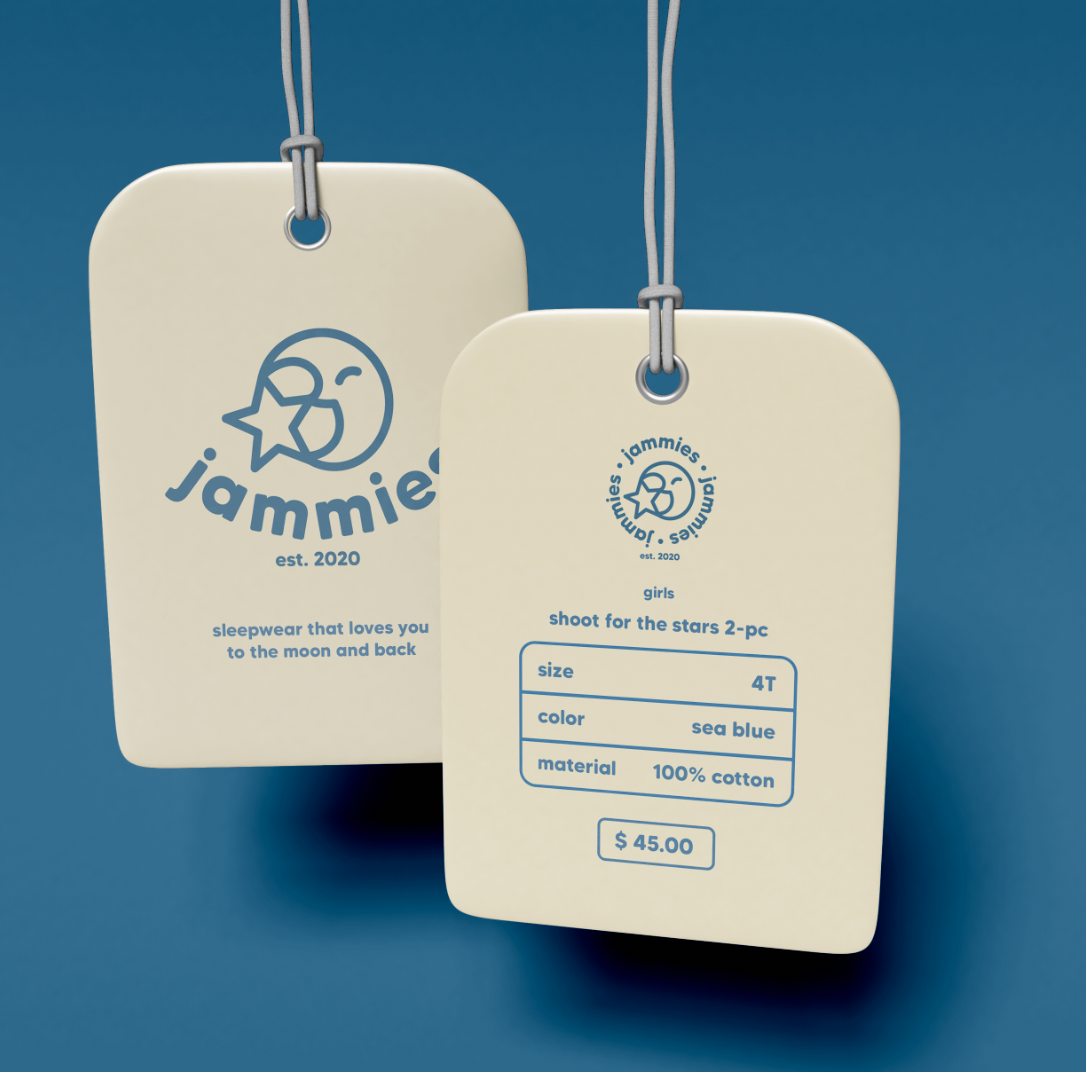
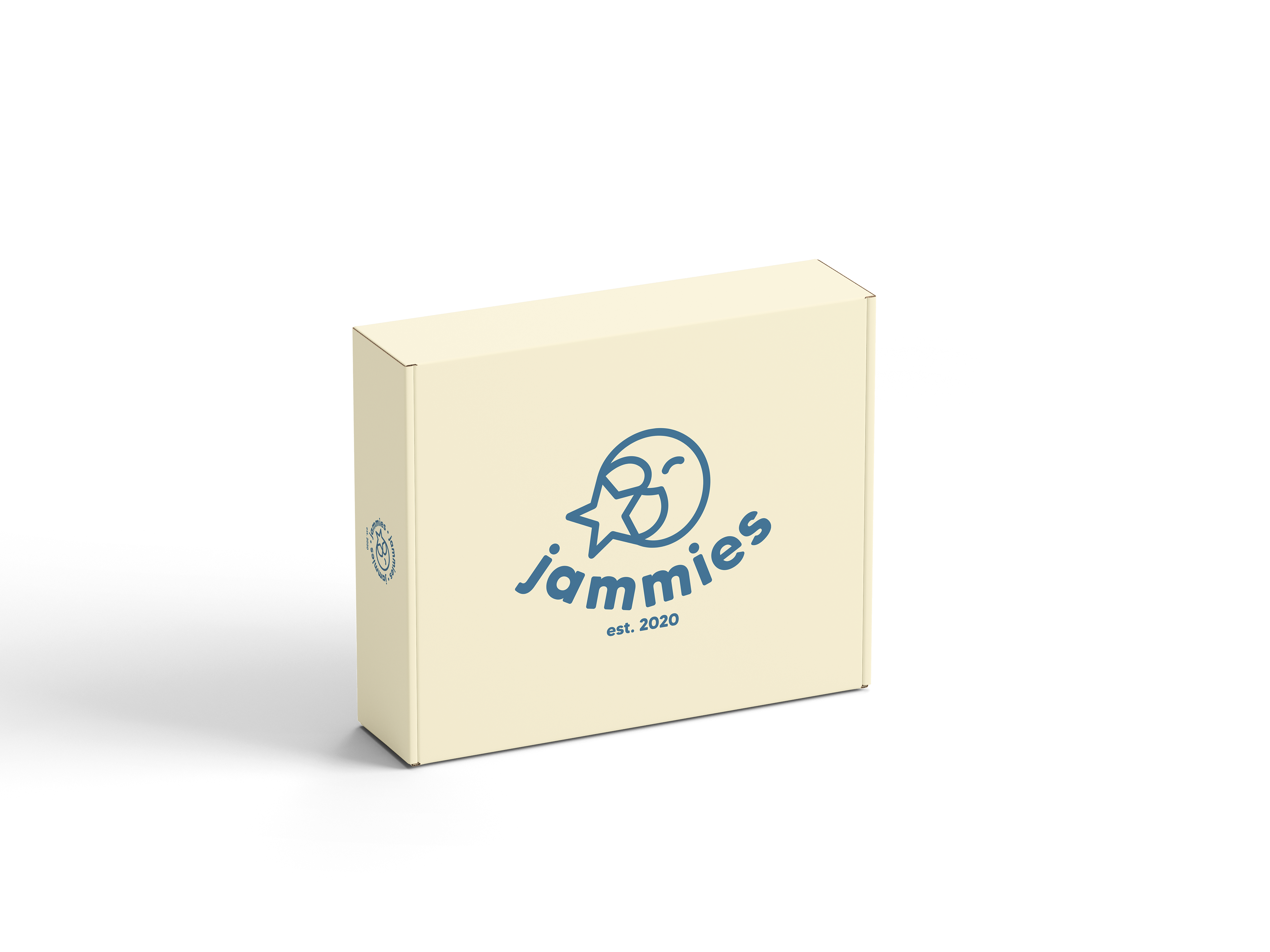
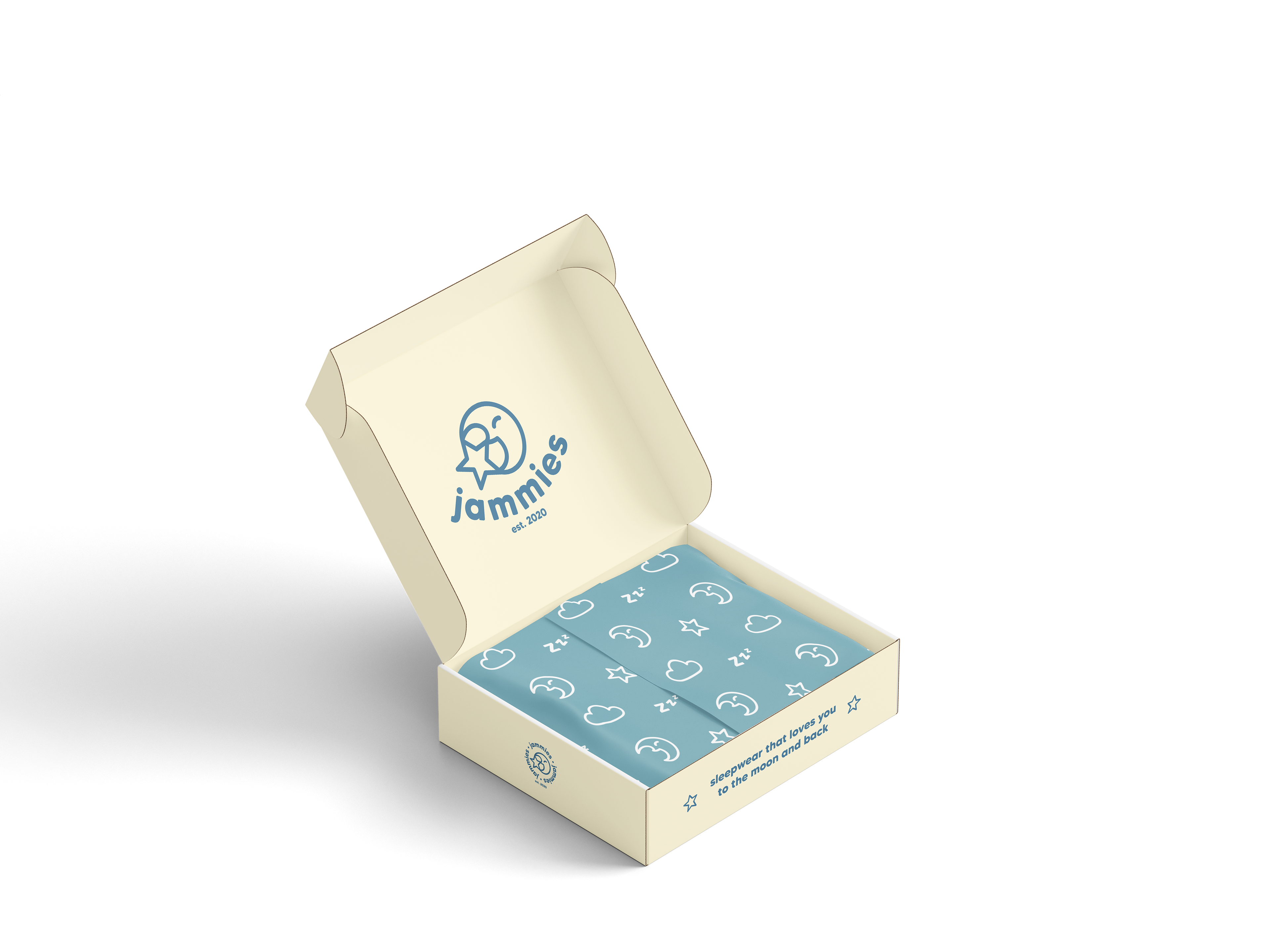
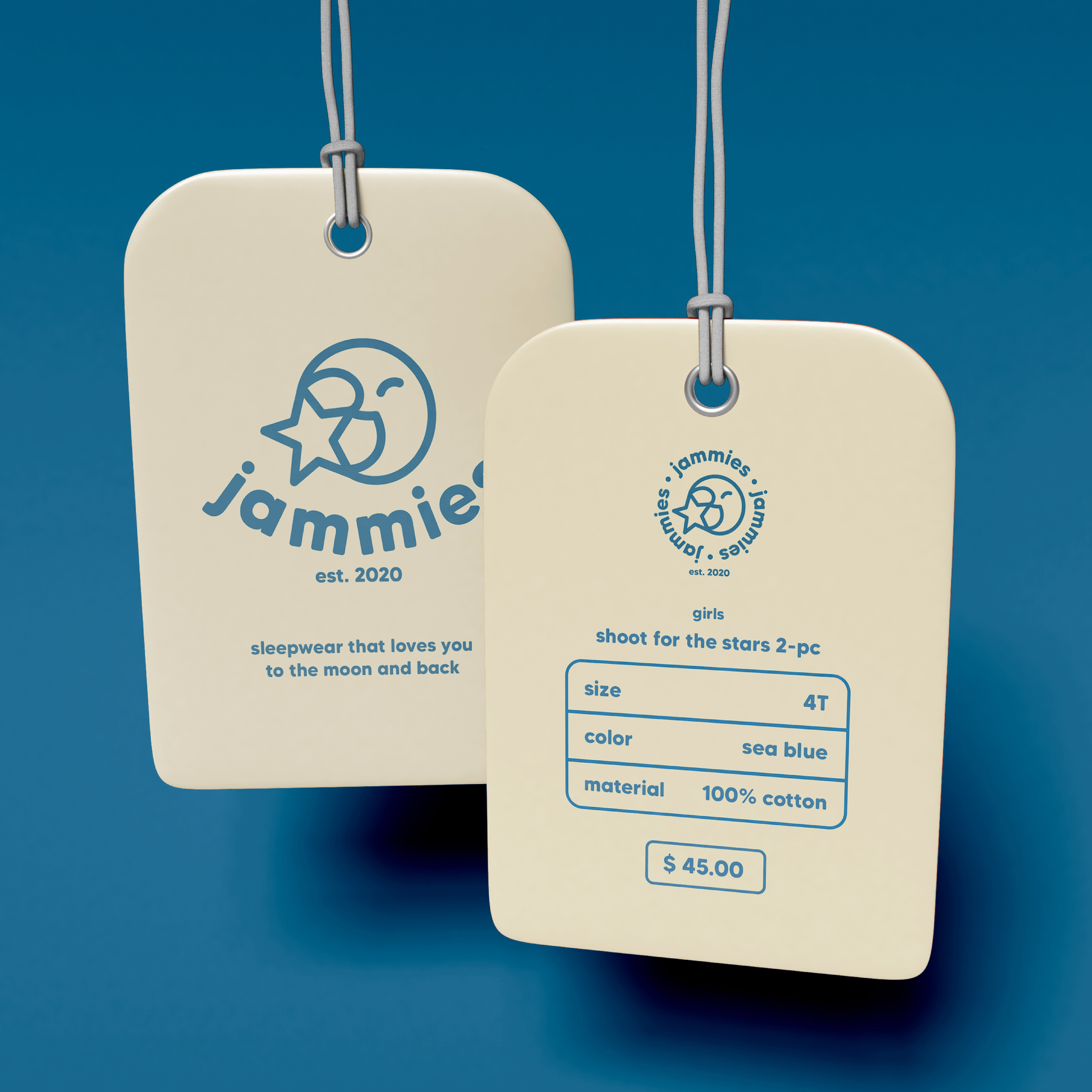
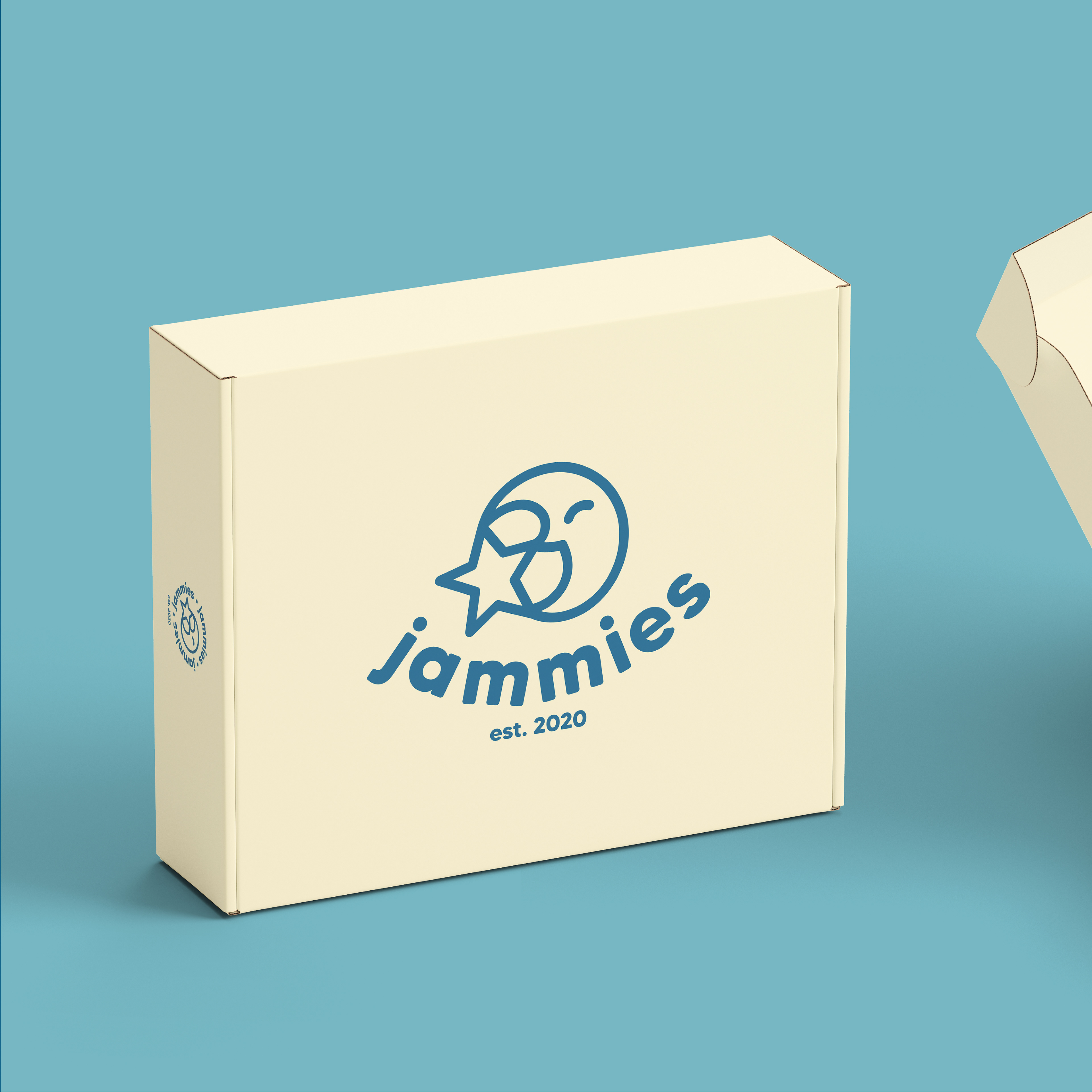
The deliverables for this project were a logo suite, physical store sign, label tags, and box package design.
To dive even deeper into the brief, I came up with a tone and target audience to help me. The tone of this brand would be kid-like but also adult-friendly, playful, comfortable, cozy, and sleepy. The target audience is kids 0-11 and parents of young children.
So, in summary, I needed to create a cozy-feeling children's clothing logo that appeals to the target audiences and helps achieve consistent branding.
2. Market Research & Moodboard
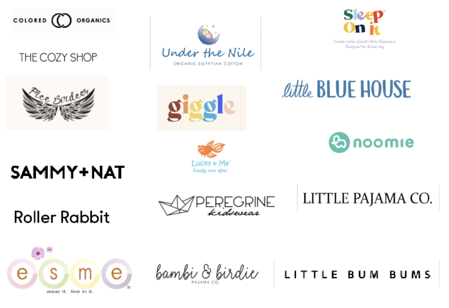
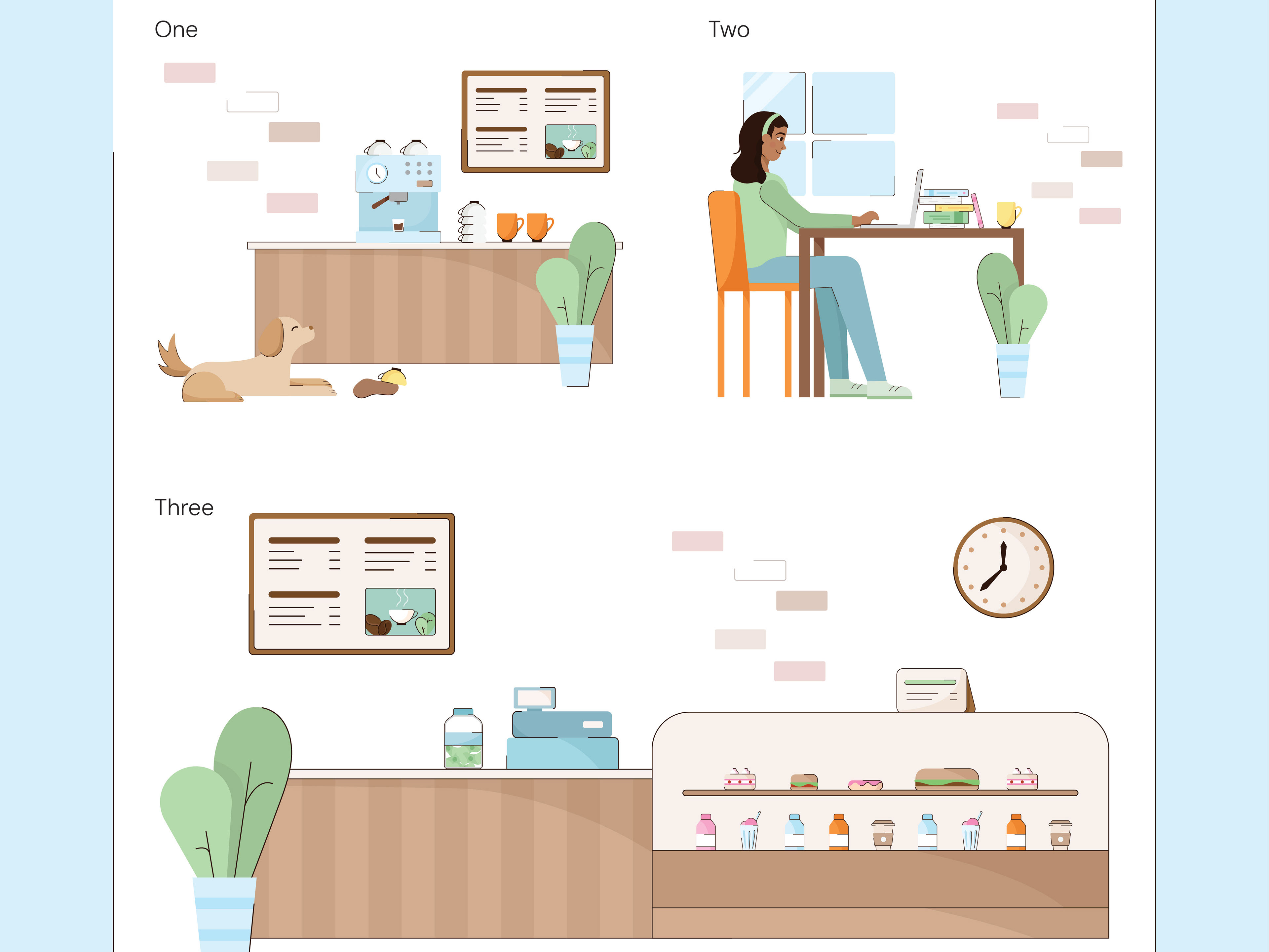
The second step in my brand design process is conducting market research. For Jammies, I researched different kids' pajama brands and collected their logos so that I could put them together and find common themes. This is done to see what is already working with these brands, and also to decide how I should differentiate my design from others.
By putting other brands' designs together, I noticed:
• There is more diversity in kids' clothing brand designs than I assumed there would be
• Most logos used a black and white font; no color
• Many used a sans-serif font; script fonts are also popular
• Some use a distinguishable icon in the logo
After collecting all of this information I thought about what my own branding could have to distinguish it from others. I decided on a sans-serif font as it went well with the child-like tone I wanted to achieve. I also decided on having a colored, icon-focused logo- Since most brands did not have this, I believed it would be good to give Jammies a strong, recognizable hand-drawn "mascot" as the icon. This would also be helpful later when designing brand elements.
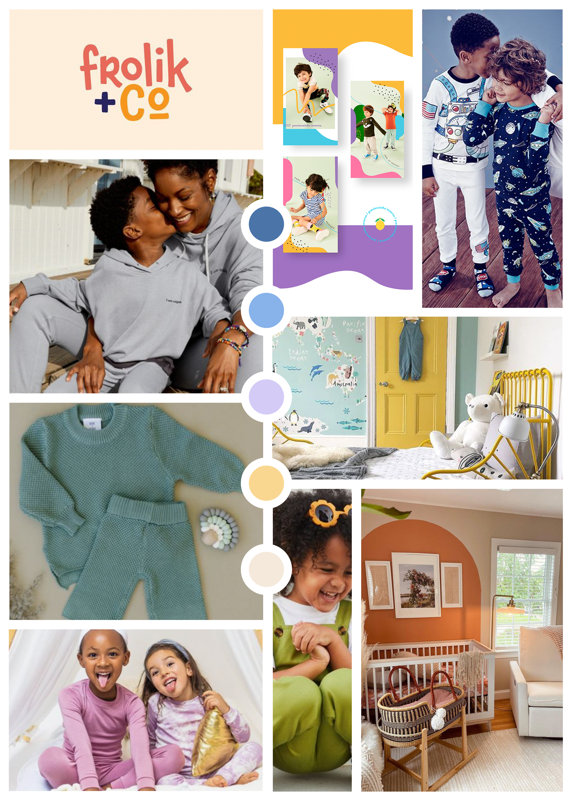
When I decided on a general direction, my next step was to create a mood board that would further guide me in deciding the feel of the brand. This was just a loose guide but helped in gaining inspiration.
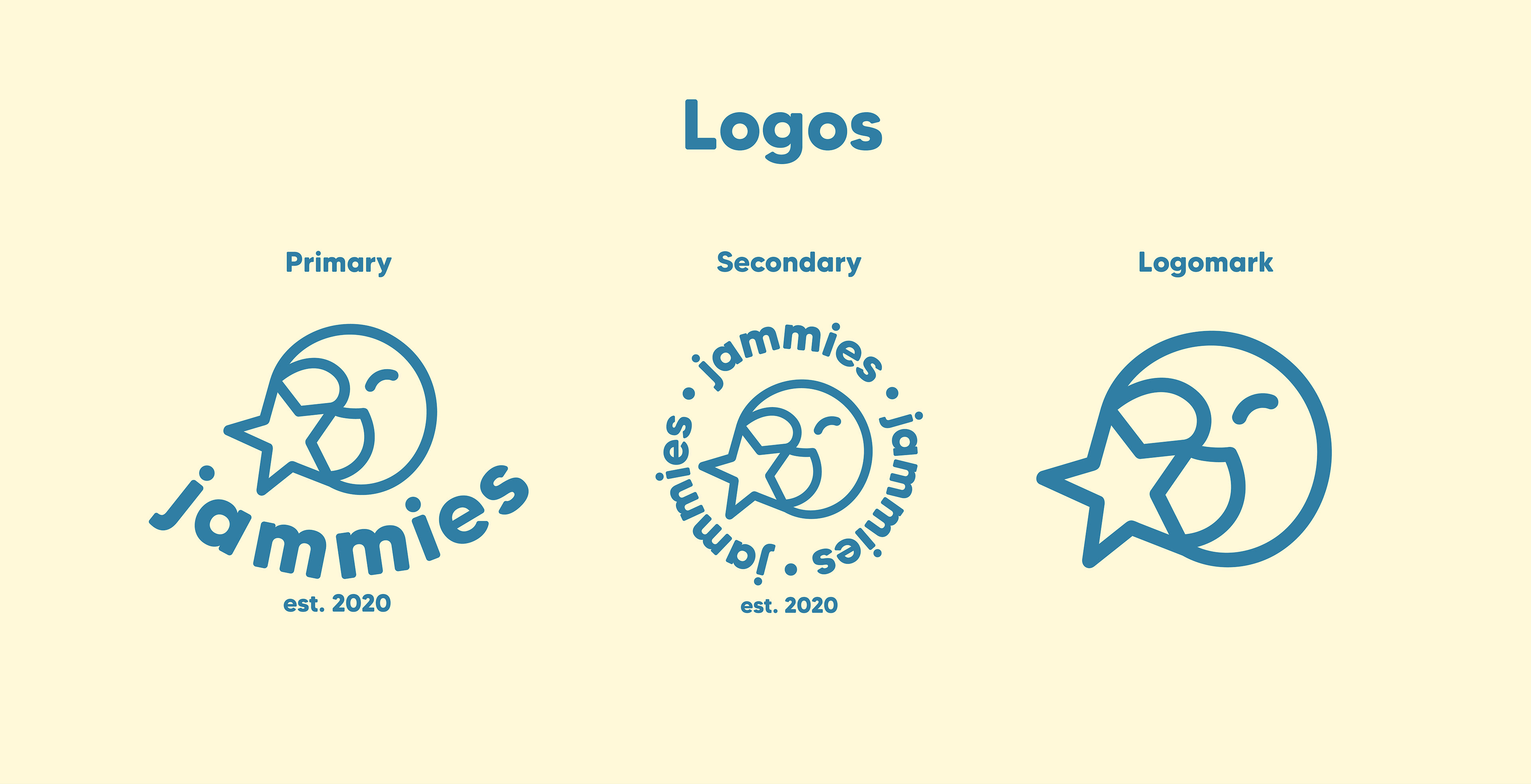
3. Logo Design
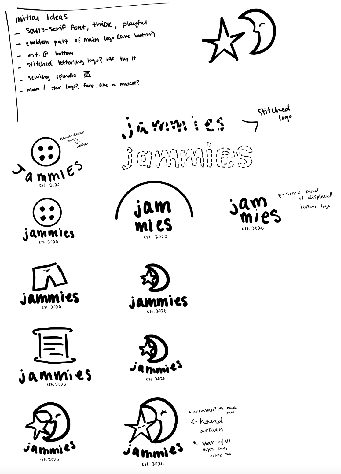
Before I create any logo concepts, I first brainstorm. I do this with all logos, starting with the words that the brand name contains, and from that, I go around it and write all the things that the word reminds me of or feelings that I get. I further expand on those as I go as well, creating a web of words and ideas. Doing this just helps to get things flowing. After the initial logo brainstorming is done, I begin to sketch ideas that I have based on the brainstorming.
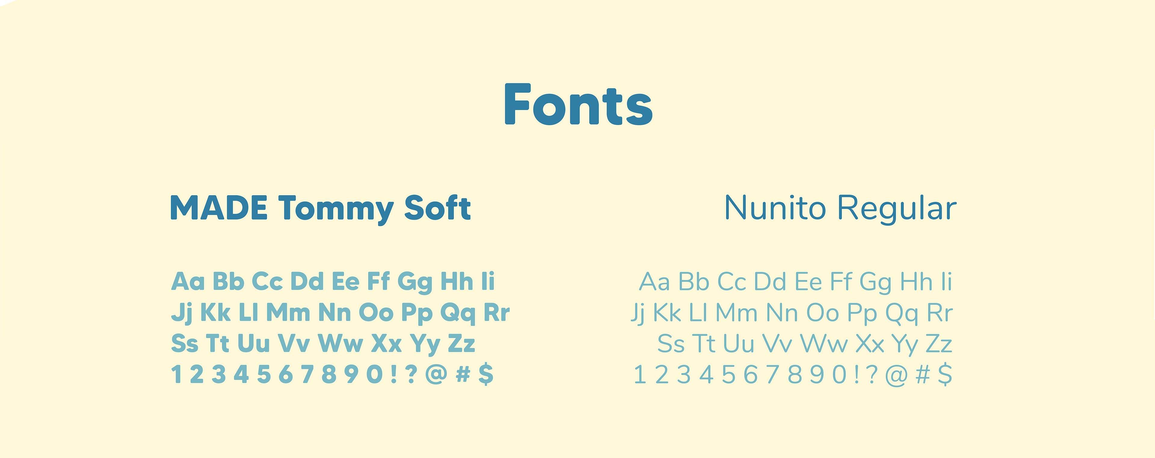
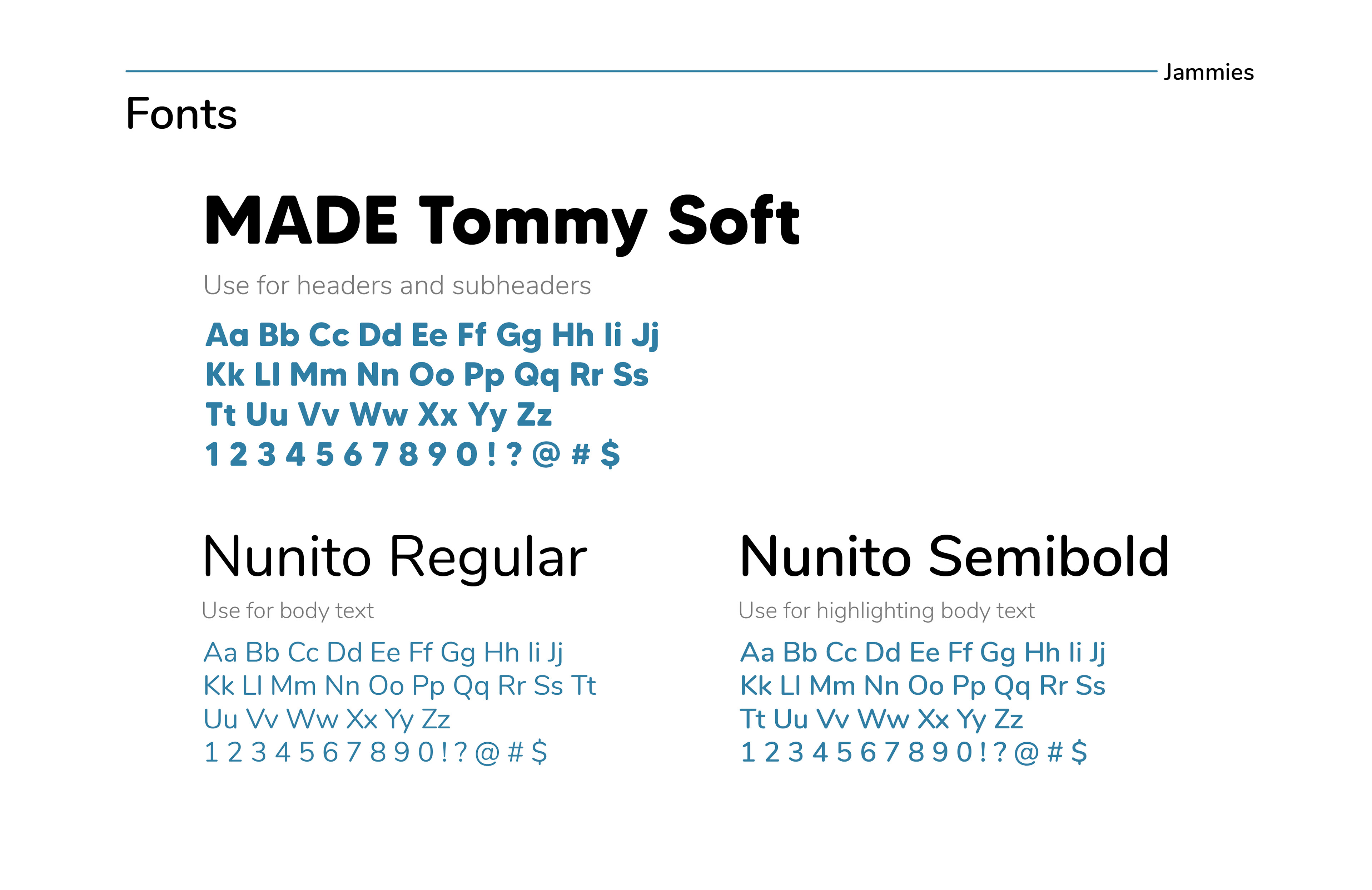
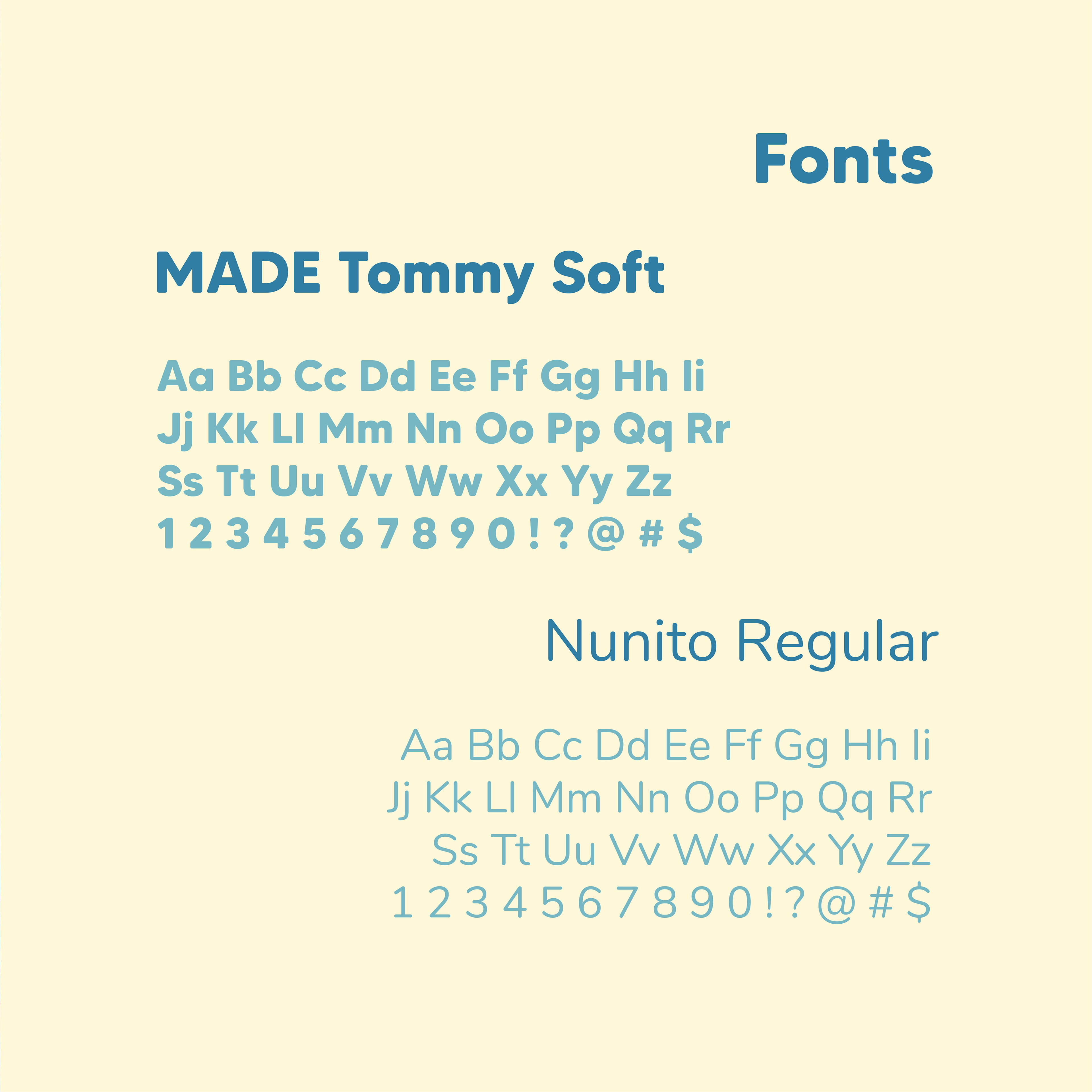
Then, I plug these ideas into Adobe Illustrator to see which ones work and which ones don't, as well as choose a font pairing for the brand.
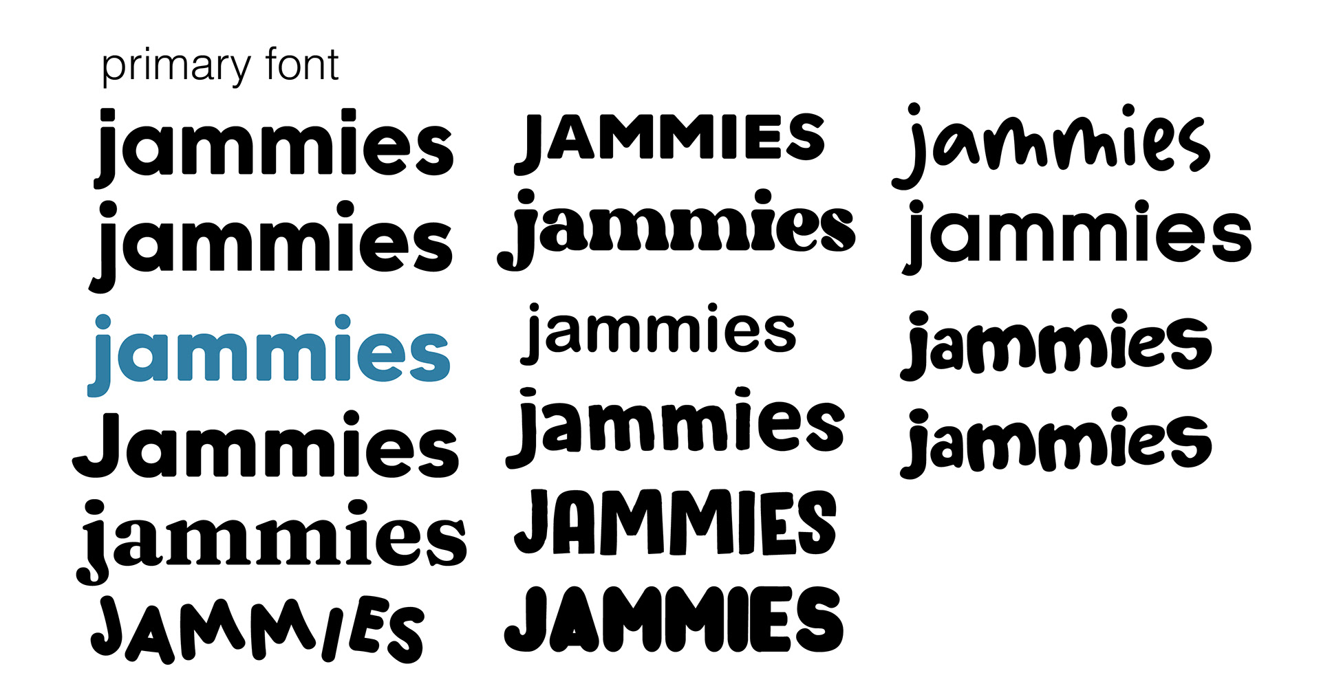
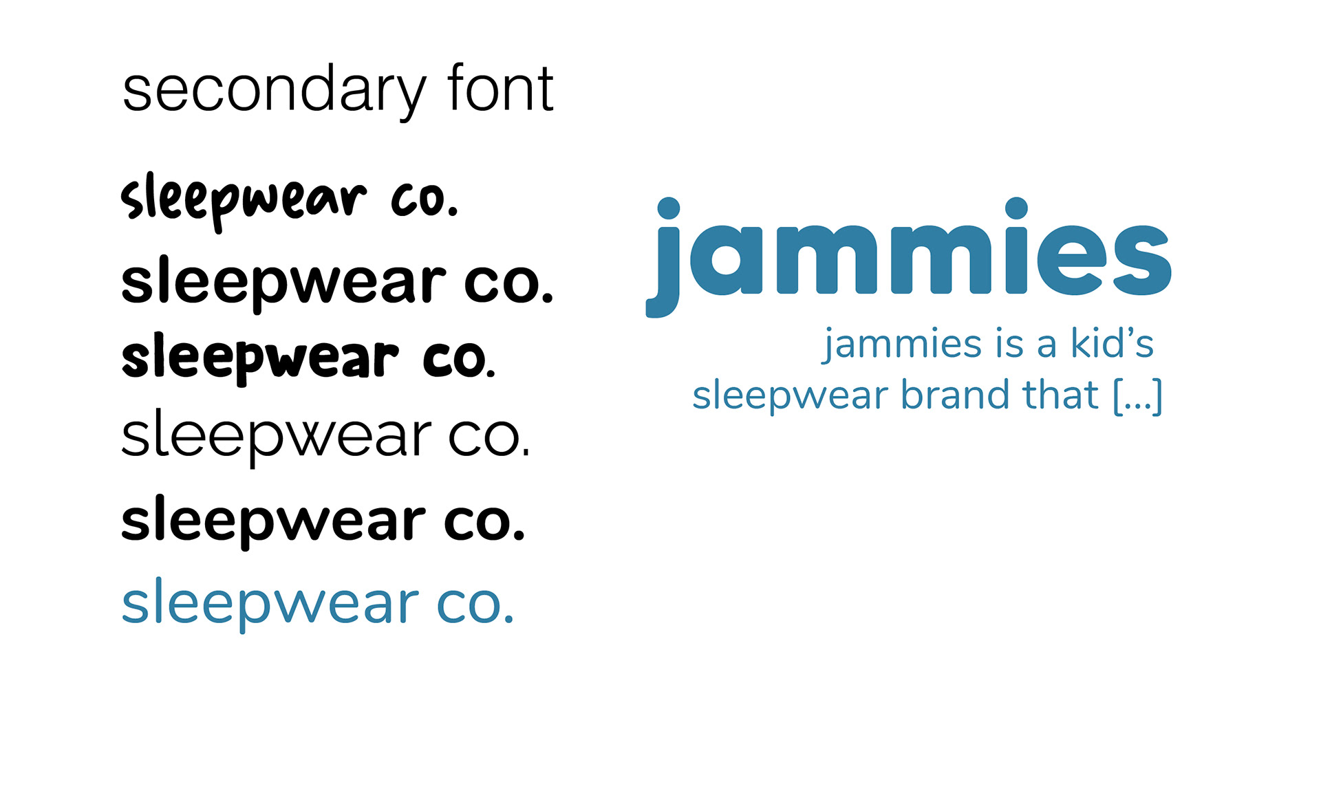
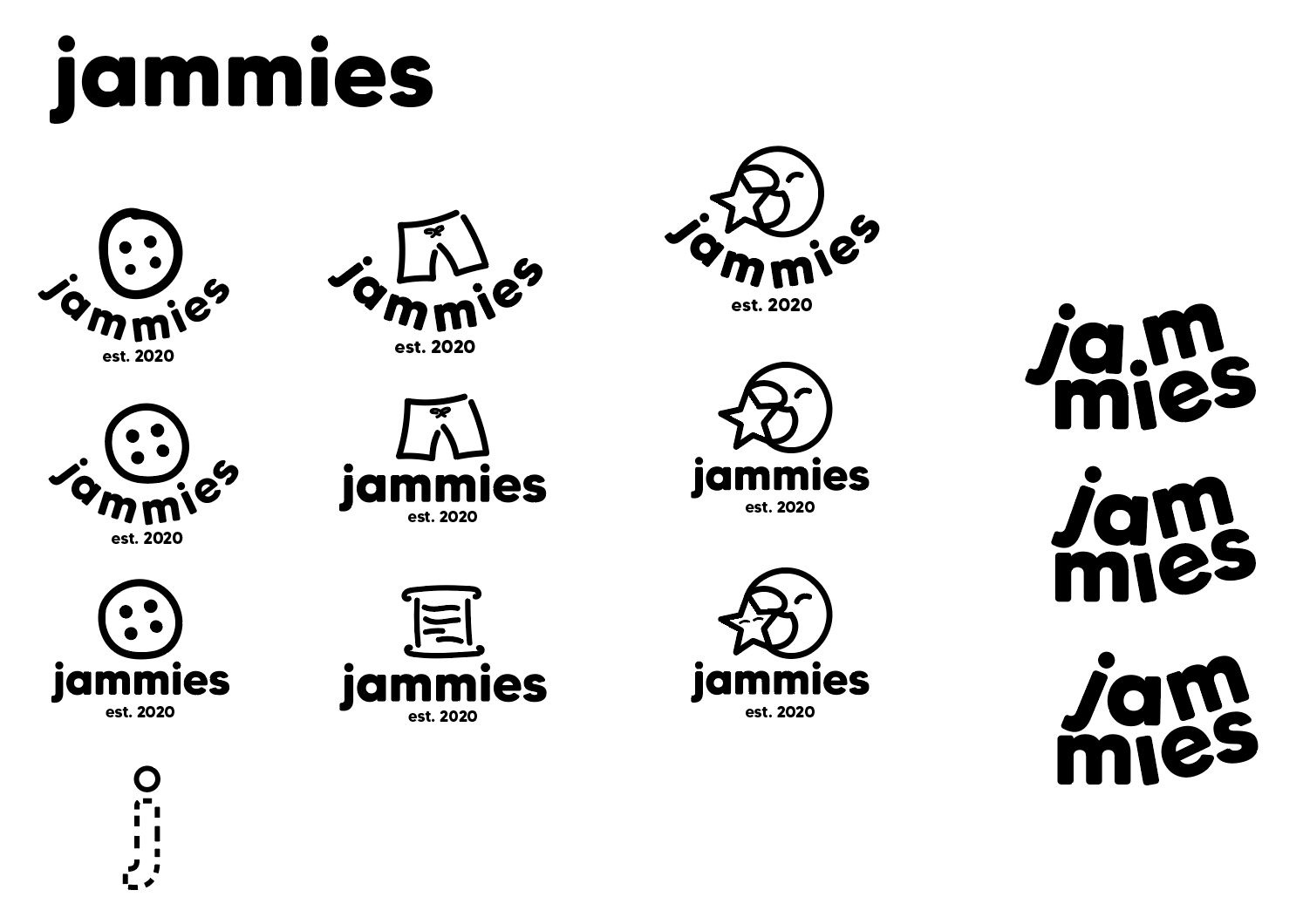
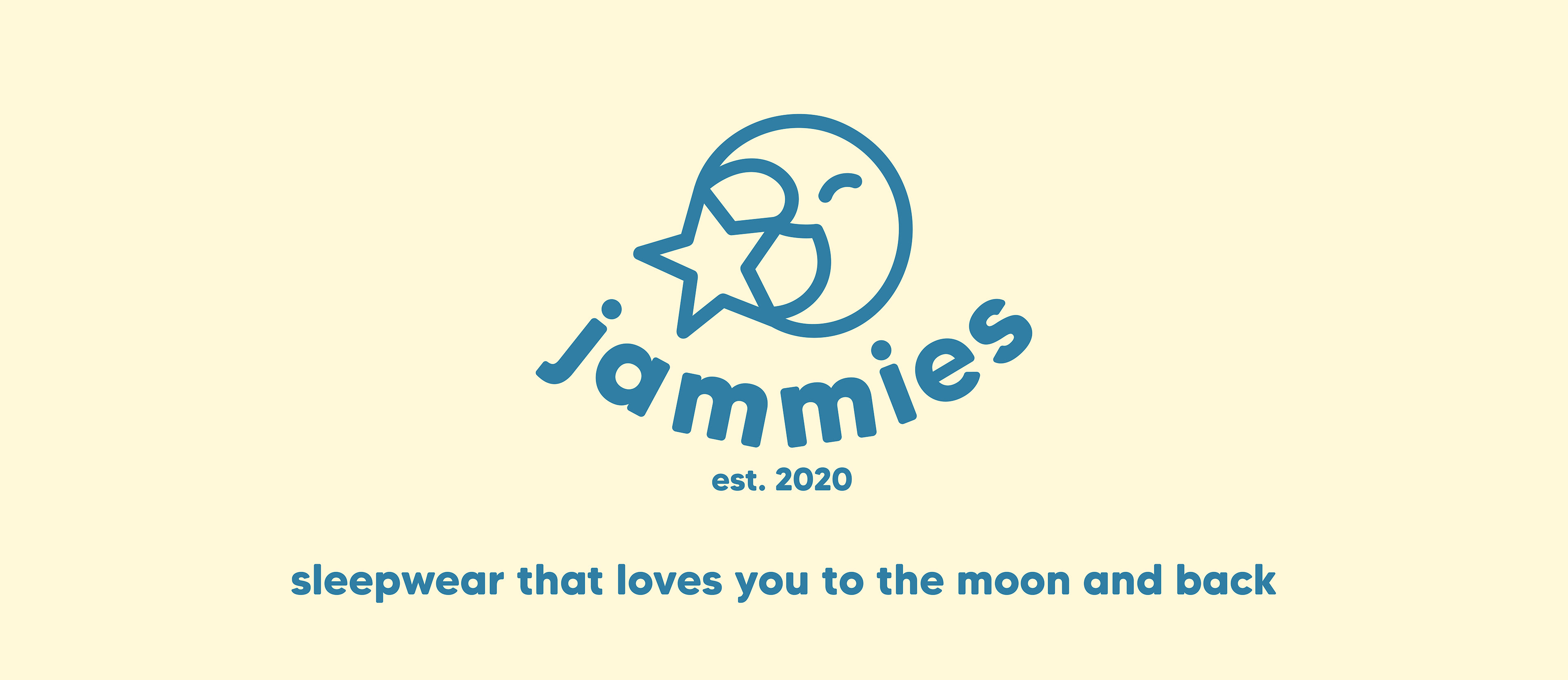
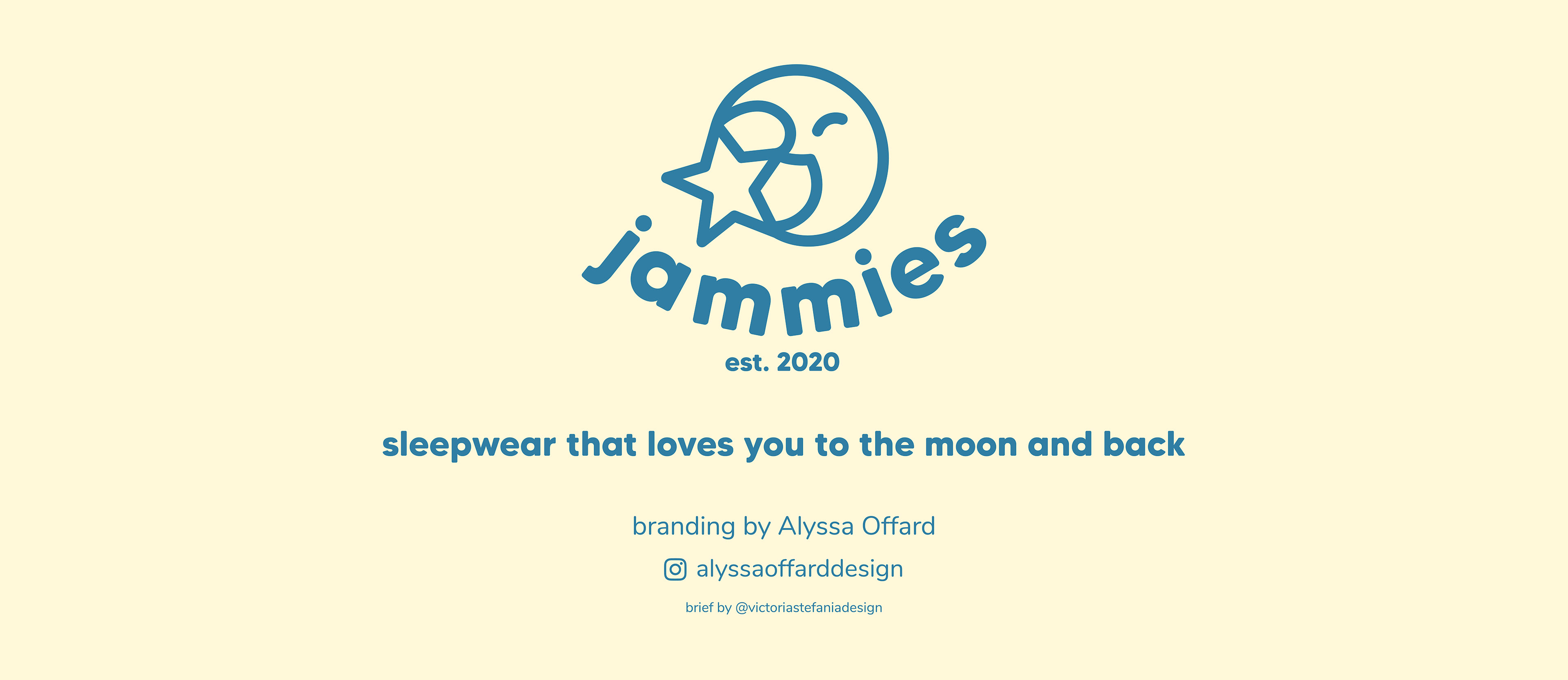
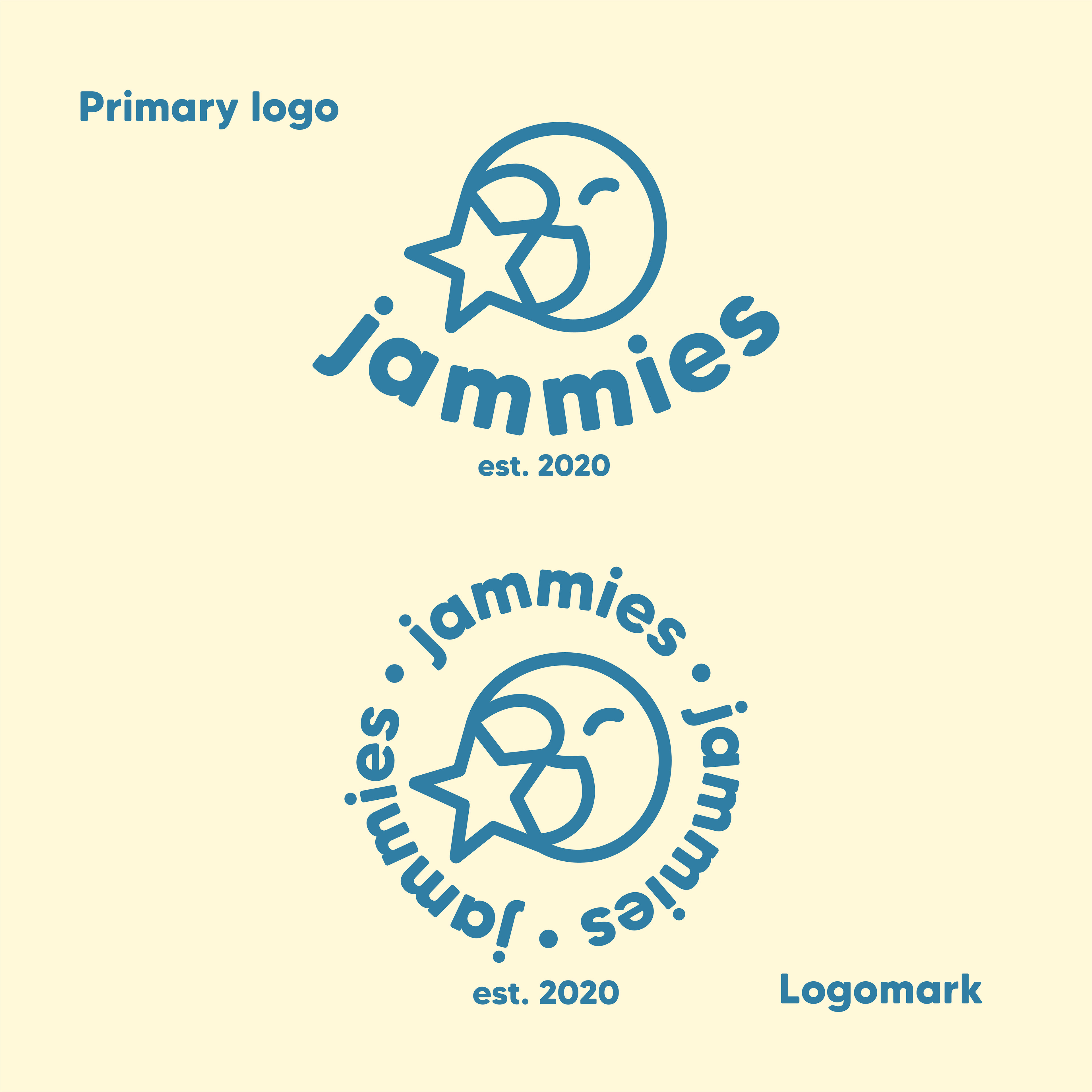
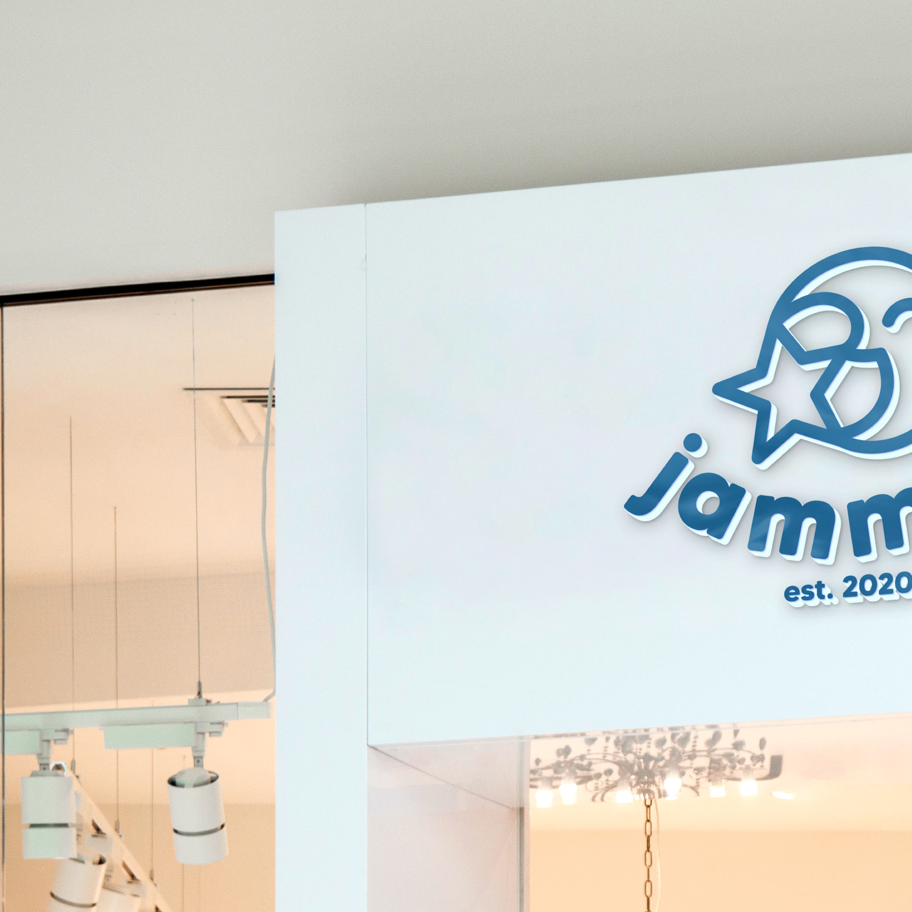
After choosing the primary font (MADE Tommy Soft), I paired my vectorized logo drafts with the font to narrow it down to the one that worked the best. While I did like some of the others, I decided that the moon and star logo worked the best for this project. The curved letters make it look friendlier to me, and I also think that having something with a "face" helps distinguish it from other brands and makes it somewhat of a mascot for the brand.
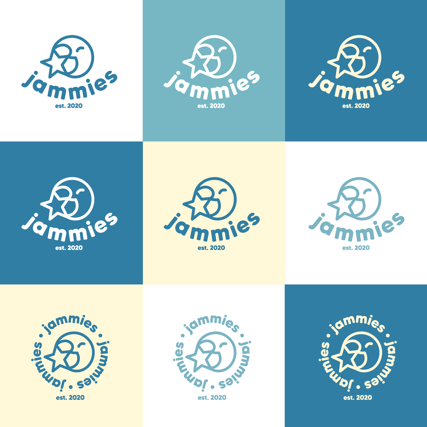
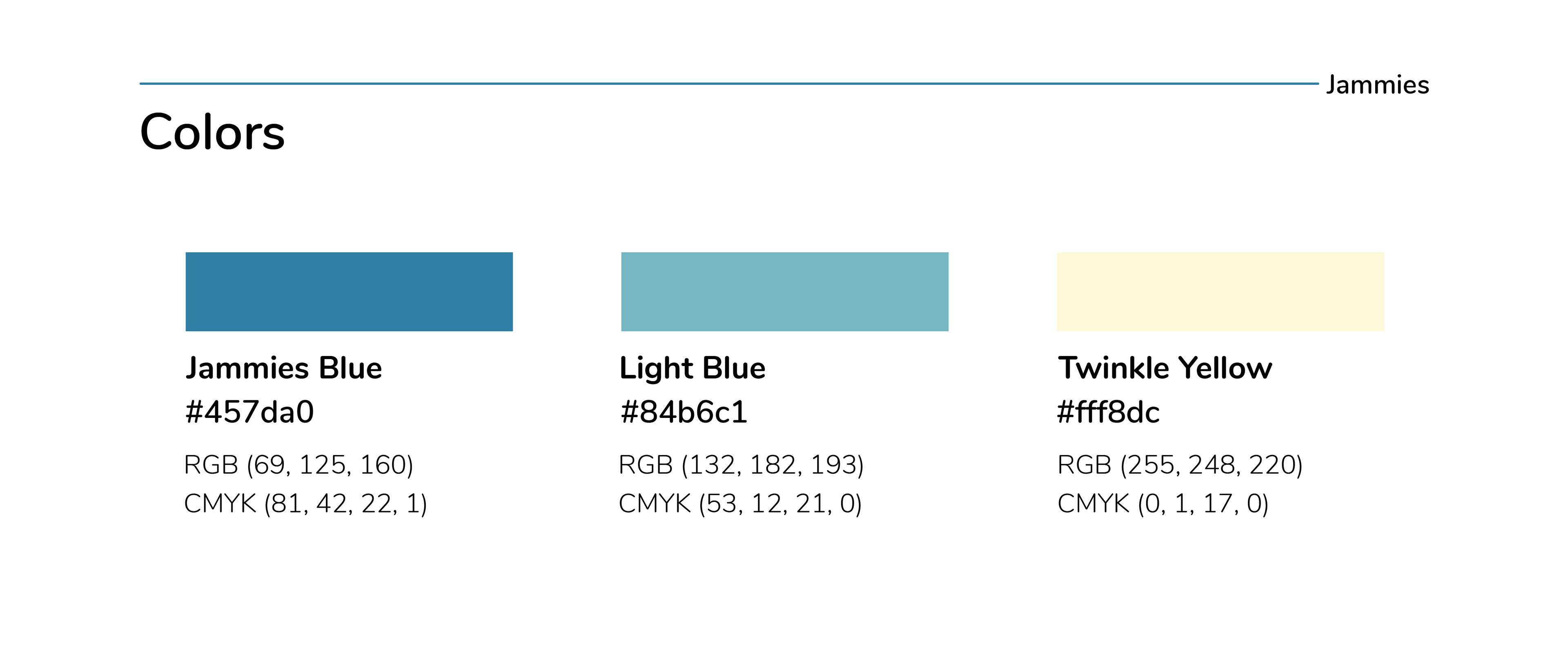
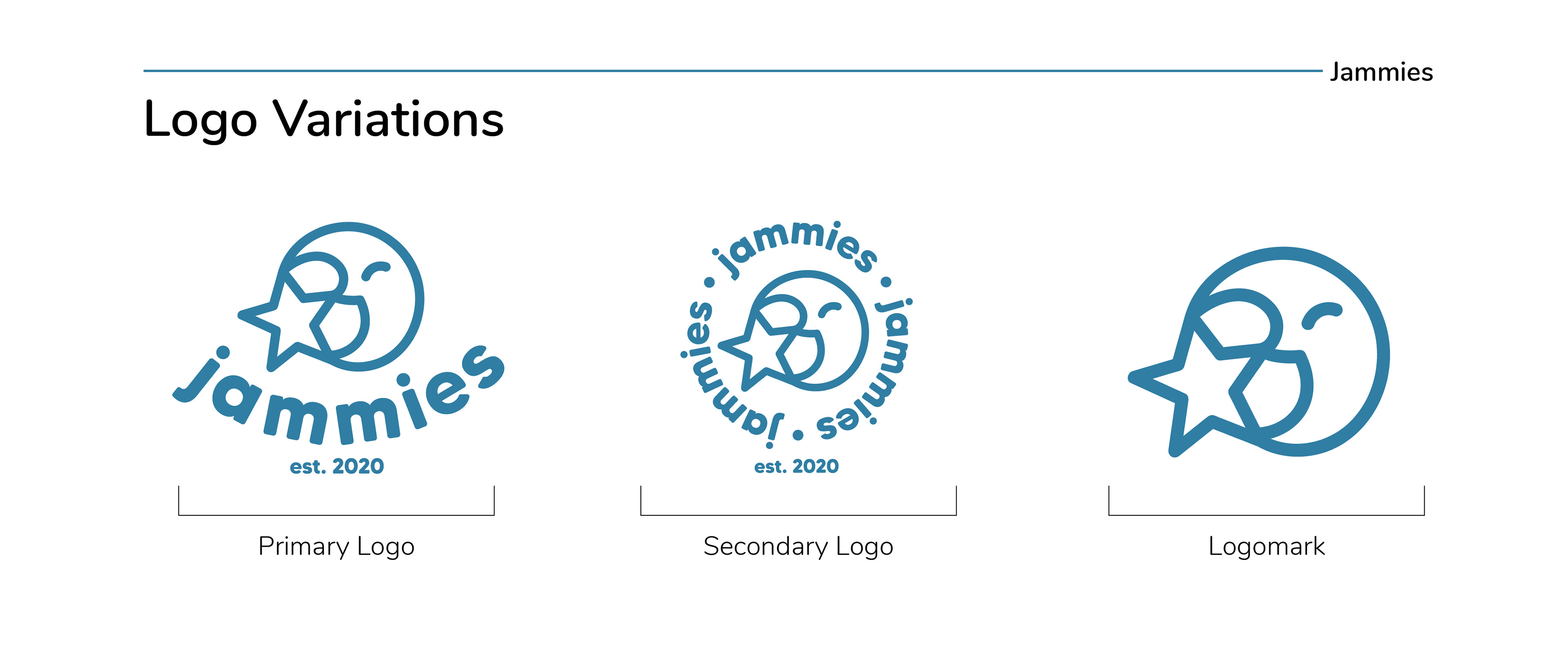
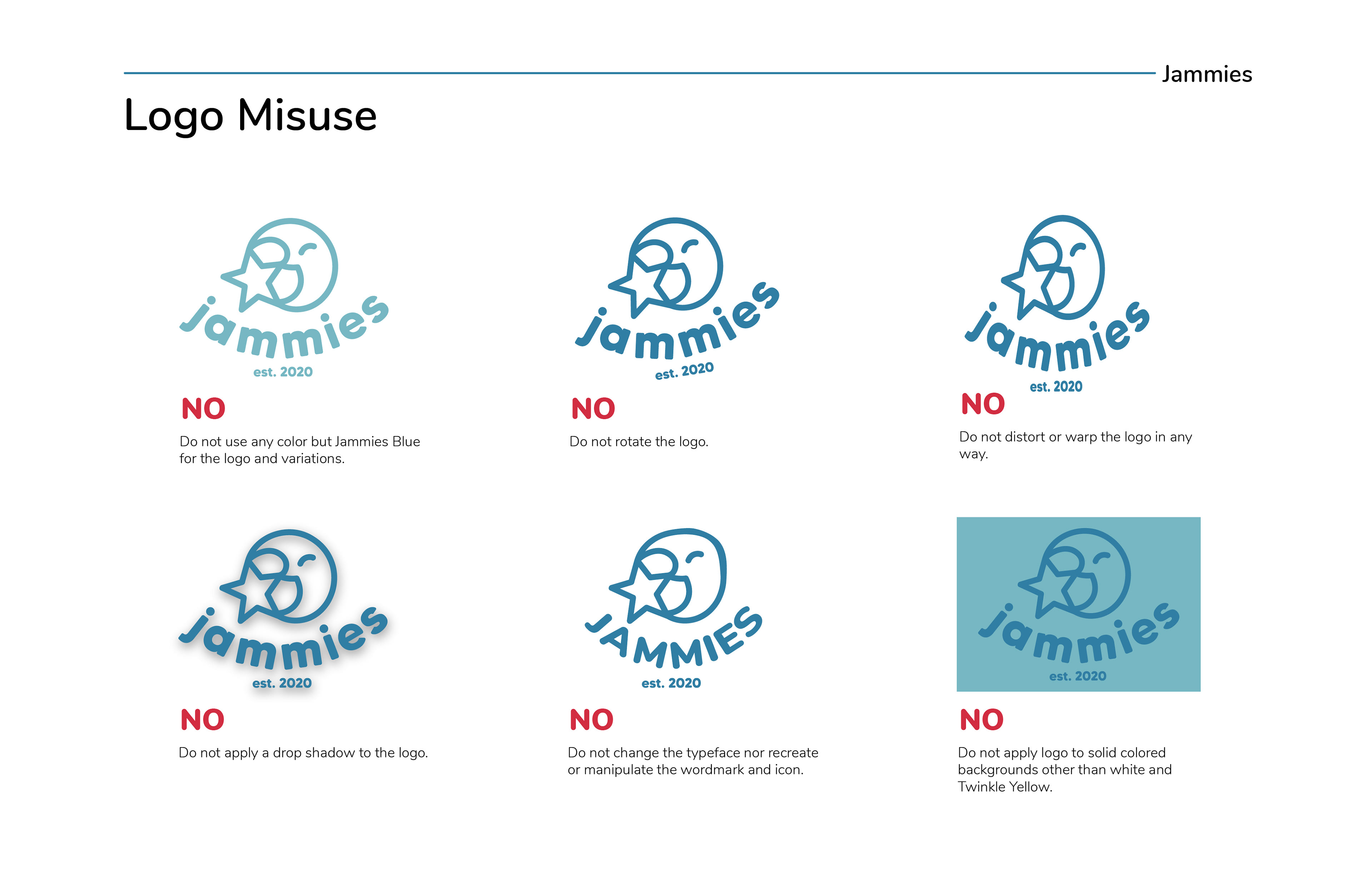
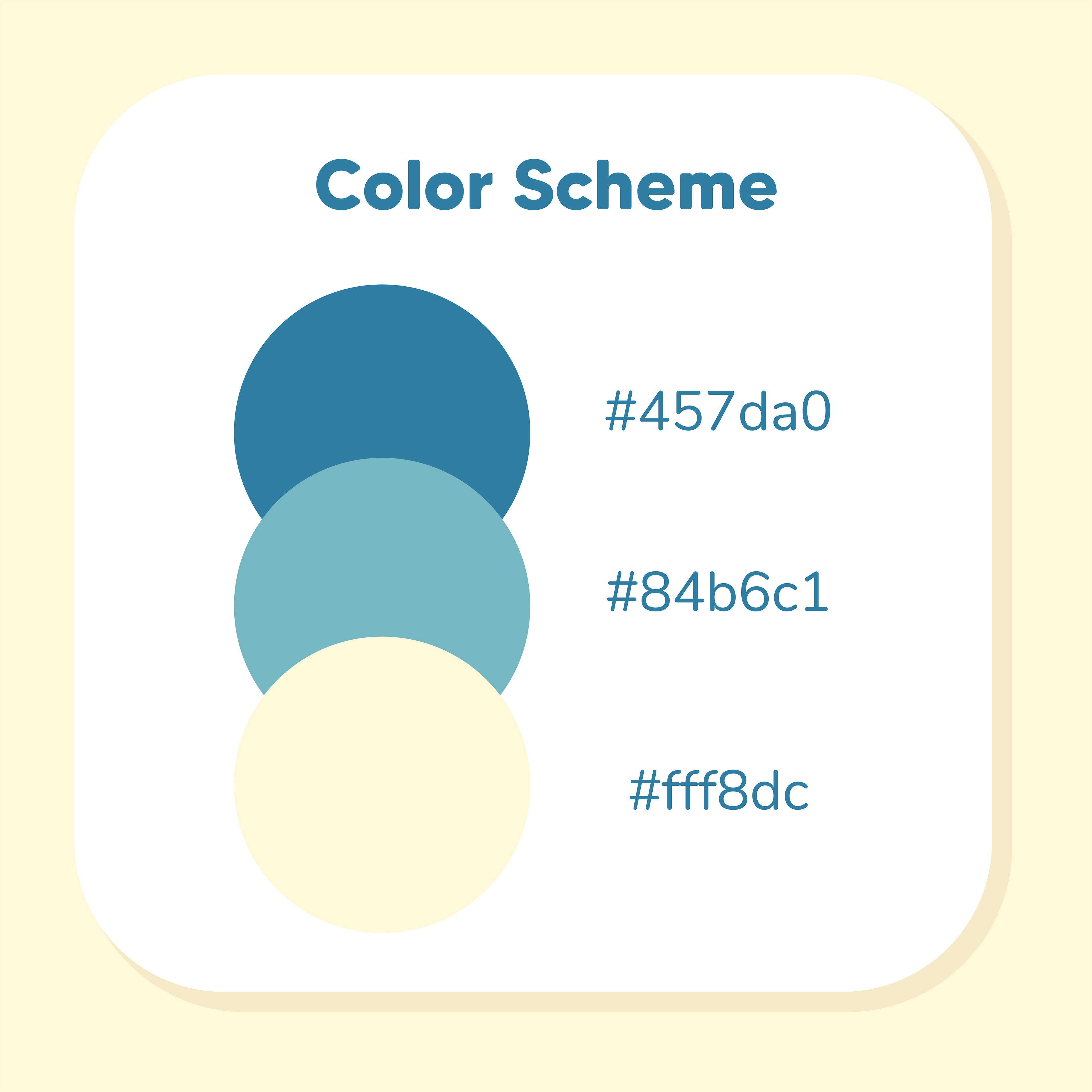
After this, I proceeded to tweak the logo and create the logomark from it. I also picked out the color scheme and tested the logo with many different color variations and backgrounds.
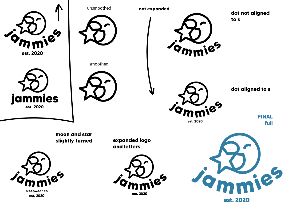

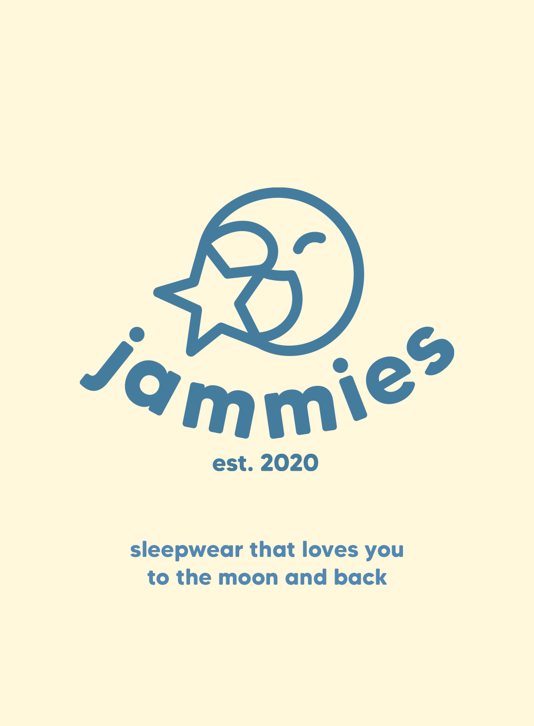
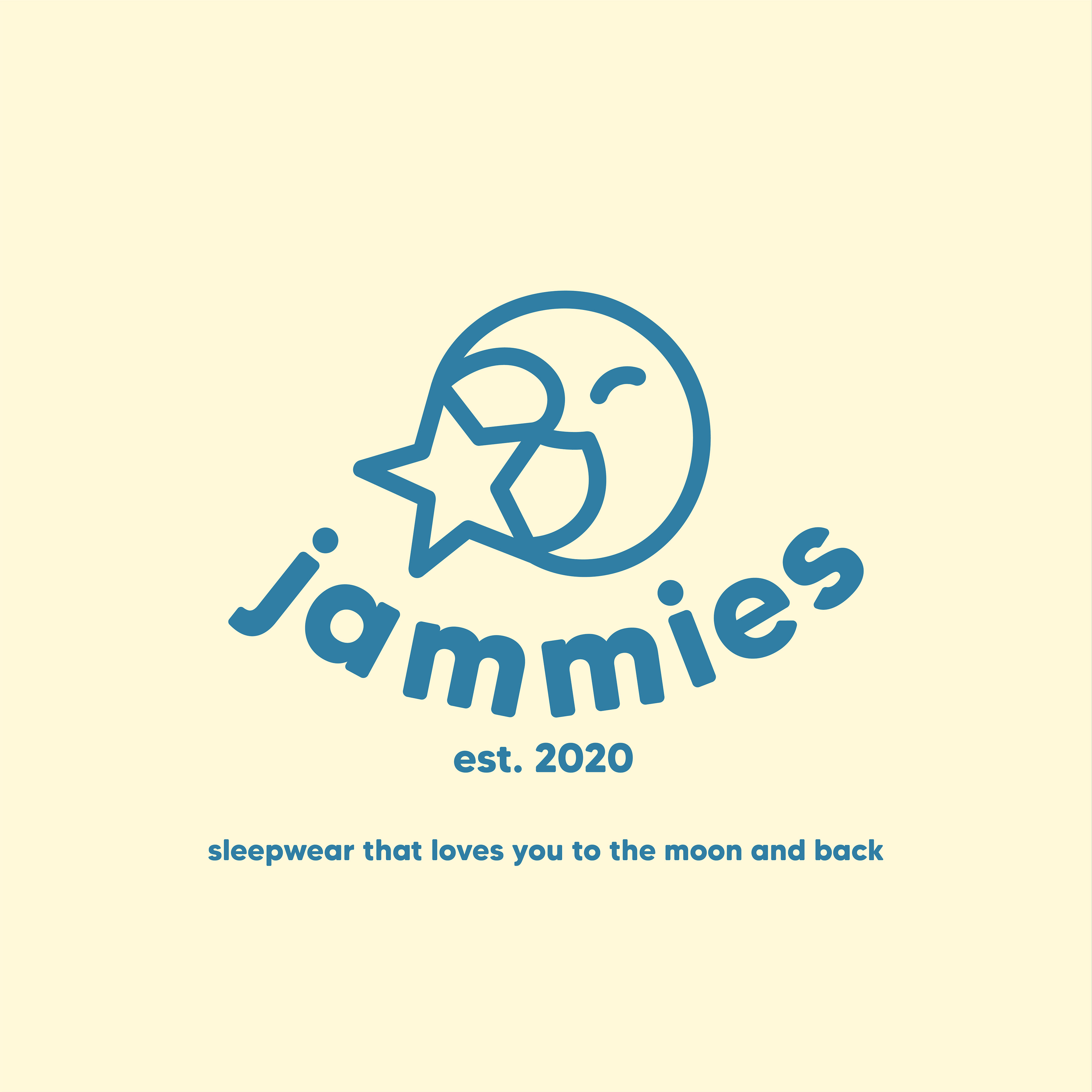
This logo encapsulates everything that I wanted it to; It is soft, cozy, represents nighttime, and is also distinguishable from other brands.
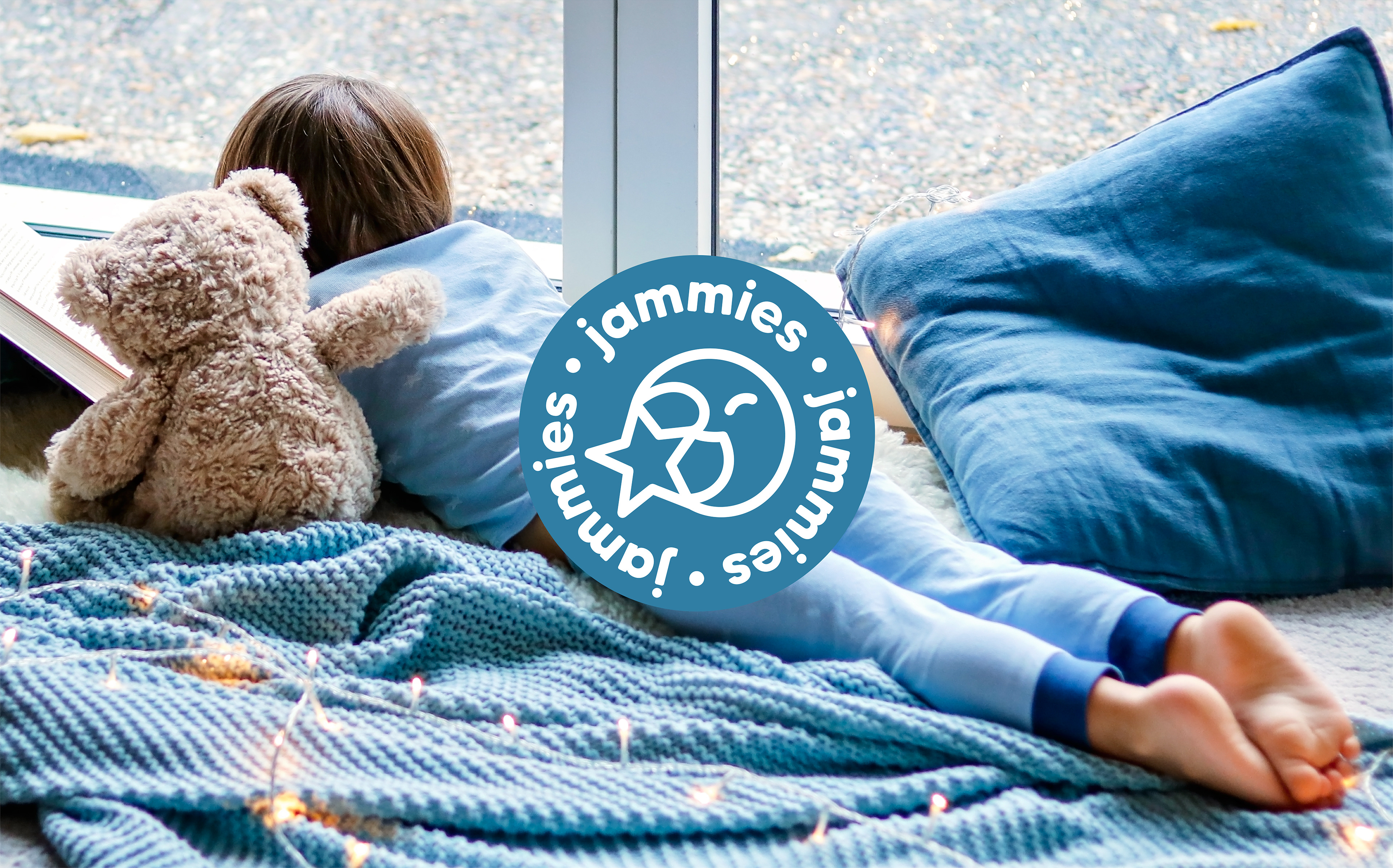
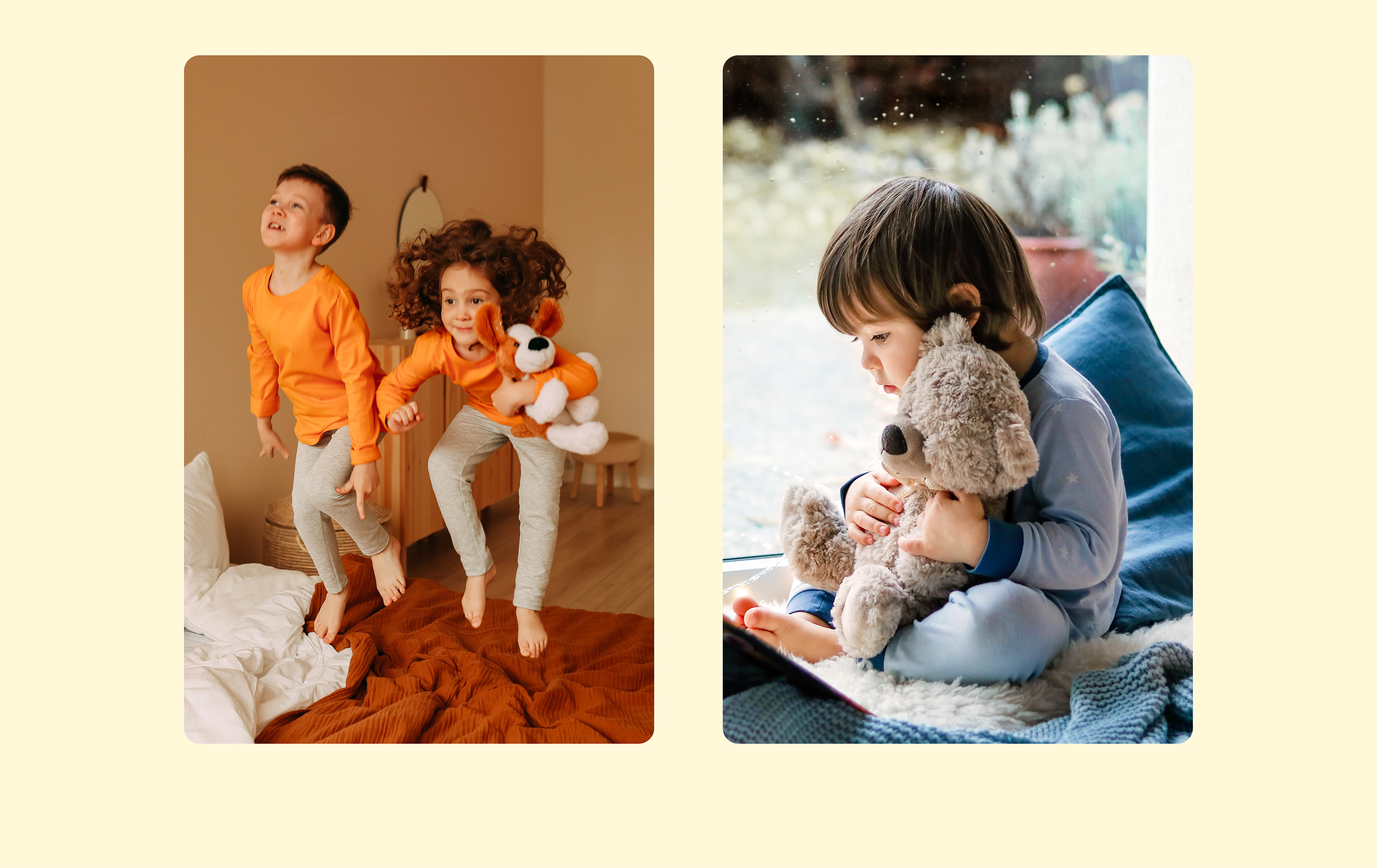
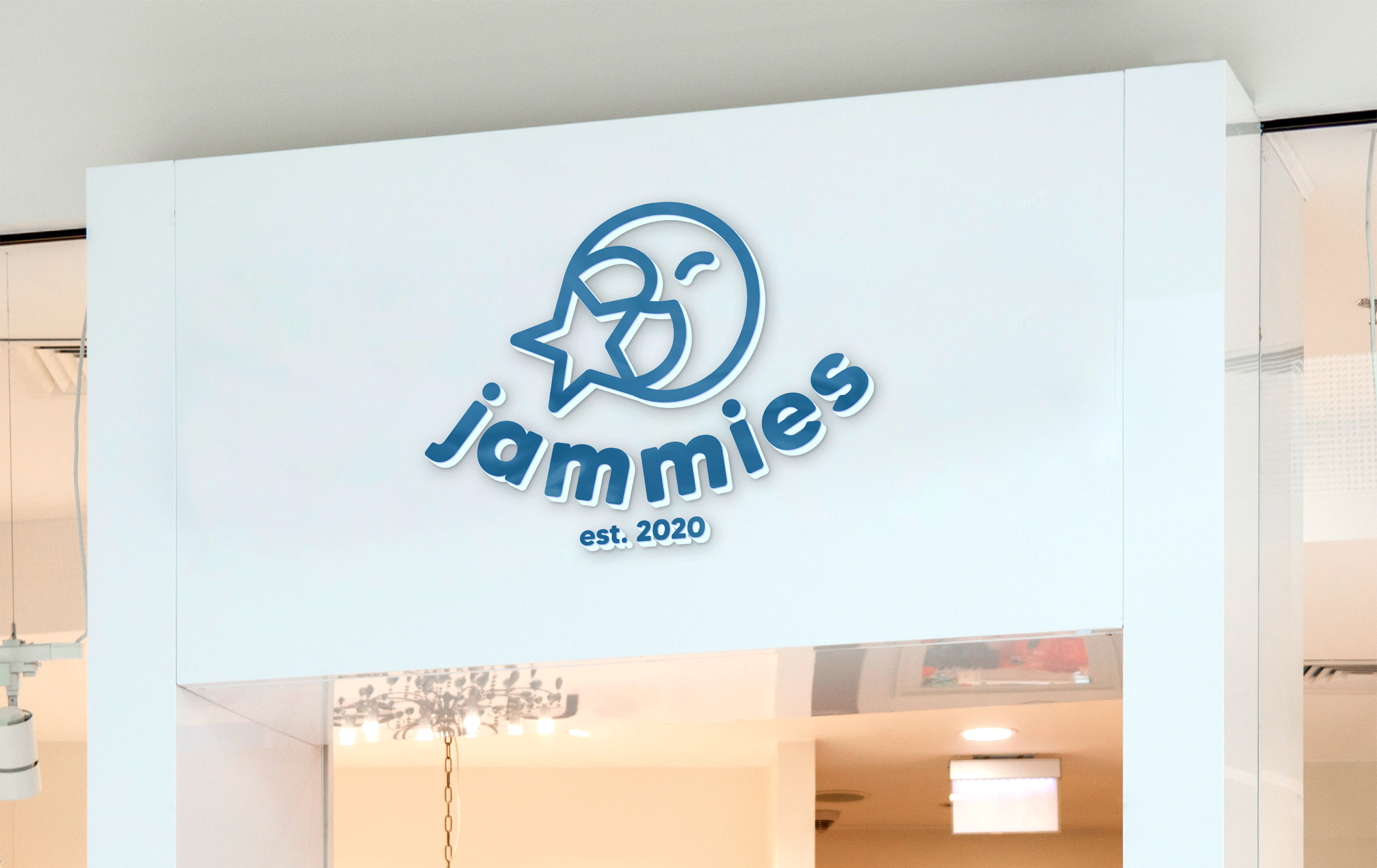
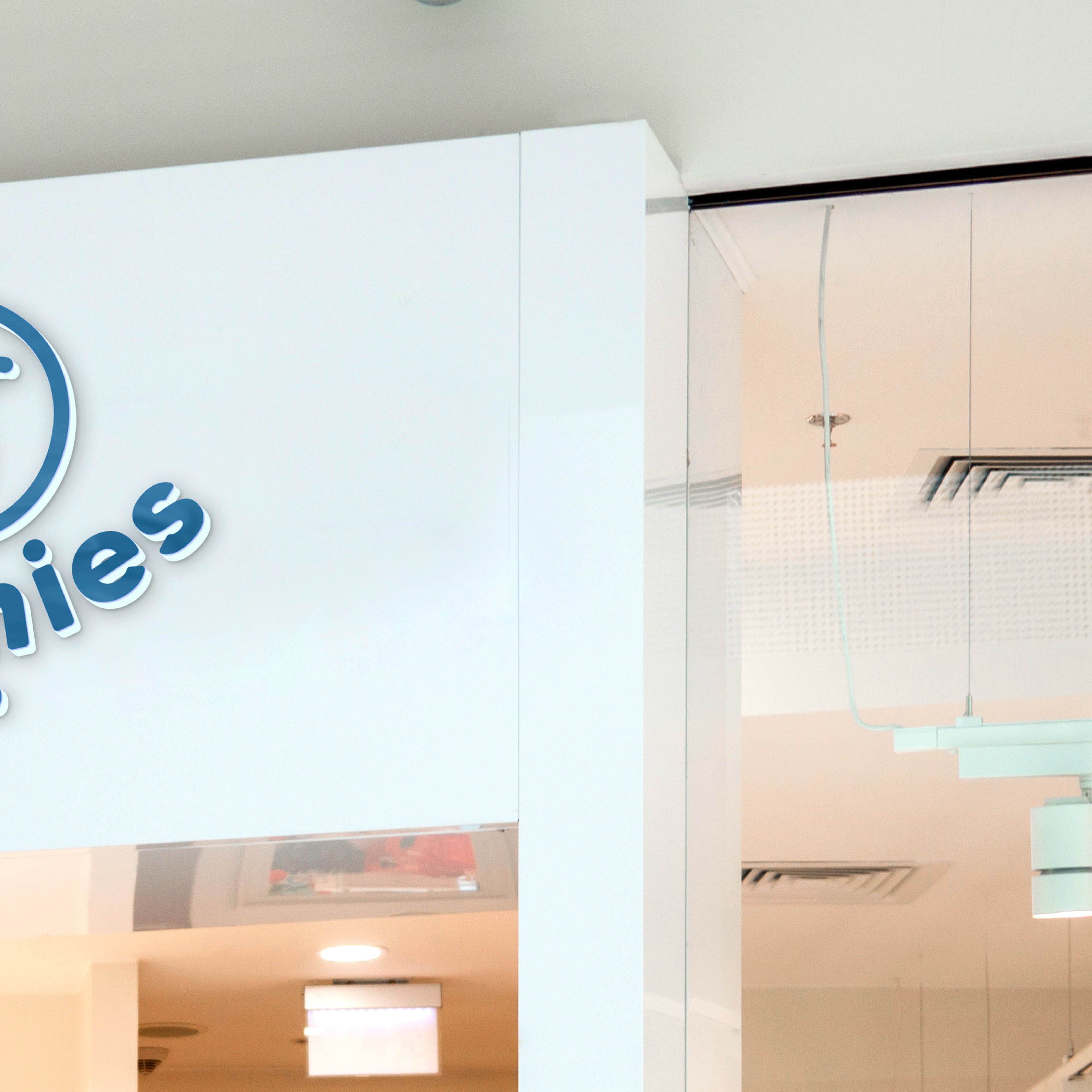
4. Mockups and Real World Application
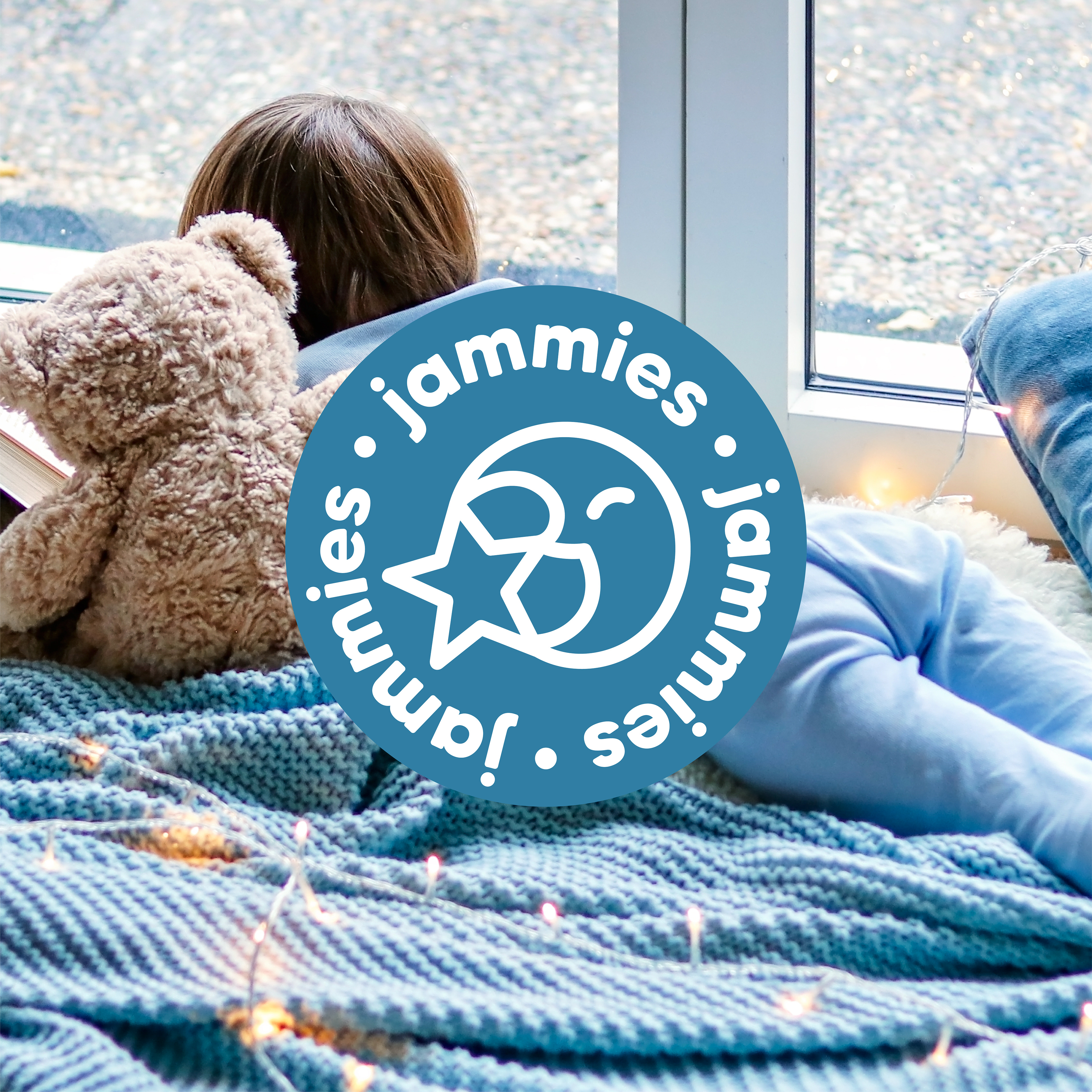
The second to last step is to apply my designs to mockups that would show how they would look and function in the real world. Designs can look good when you look at them on a computer screen, but we visualize things much better when they are on things that we are familiar with. Because of this, I always make sure to include mockups to ensure that branding looks as real as possible.
With the mockups, I complete the label tag, box design, and storefront deliverables.


5. Presentation
The final step is to lay out and present all of the branding. For this project, I chose to do it as the vertical scroll presentation showed above, but there are many other ways to present branding. From here, if this was a real project, it would be sent to the client and revisions (if the client has any) would be made until it is perfected for their needs. Brand guidelines are also provided to make sure that consistent branding is achieved going forward without my assistance— this guideline is as follows.
Extra: Social Media Posts


Thank you!
Thank you so much for checking out this project, it means a lot! I really like how this turned out and I'm excited that I was able to narrow down my branding process, and that I was able to share this with others!