Over the summer of 2023, I had the pleasure of interning at Nuance Communications, a Microsoft company. Nuance Communications offers tech solutions for enterprises and healthcare through their speech recognition and artificial intelligence software.
My main projects for this internship were designing and launching campaign materials, re-organizing and expanding the existing illustration library, and writing a blog post with other interns. Below is a detailed overview of all of my completed projects and their processes.
This "Summer Time Savings" campaign was a shared project between me and the other marketing interns in which we all collaborated to launch a campaign that advertised a webinar being hosted in August of 2023. The campaign's message was centered around the idea of taking a break during the summer months and allowing Nuance's solutions to do the work. While my colleagues worked on copywriting and customer acquisition, I was responsible for creating the visuals for the entire campaign.
Box design
1. Research
I first studied Nuance's previous mailers, taking note of trends and motifs I noticed. At this point of the project, I was still getting acquainted with Nuance's brand guidelines, so I took this time to get even more immersed in it before I began designing.
2. Asset Gathering
Once I had a good idea of what previous mailers looked like, I began to gather assets that would be helpful, like color palettes and gradients, typefaces, logos, etc. and put them all in one place in preparation for build-out.
3. Build-out
To start the build-out, I began by creating mockups so that I could quickly present my design concepts to the rest of the team. I presented two color options for the box, but ultimately we decided that this purple-blue gradient was best as those colors were very recognizable as Nuance, and it also fits the summer theme, with the vivid blue being reminiscent of an ocean. I also added bright icons that cover the front of the box so that recipients will get a general idea of what the box is about before reading any copy. Overall, the colors, white text, and icons give the box a clean, fresh feeling.
4. Application
Once the design was approved, I cleaned up the official pattern and recreated the design on the official dielines. I printed and folded a few of these boxes on my own to make sure that all the icons lined up perfectly, finished up revisions, did a final look-over, and then sent the files over for production.
Postcard Insert
1. Research
The postcard insert is the first thing that a recipient will see upon opening their mailer. As with the box design, I first went into the company's archives and studied previous postcard designs to see what was usually done and how mine could be different while still being appropriate for the brand and this specific campaign.
2. Choosing an Image
It was my task to choose the primary image that would be used for the campaign. The image had to feel authentic and in-the-moment, active, have good lighting, and feel appropriate for summer. Pictured are all the images that were under consideration, but ultimately, I decided on the top image. It has Nuance's colors, it feels very authentic, and it also tells a story as you open the direct mailer— The image shows a girl pouring water on her dad, then the headline of the postcard reads "We've got you covered", and finally, you fully open your box to see a towel included.
3. Build-out
After the image was chosen, I proceeded to design the rest of the postcard. I included icons on the front of it that continue the pattern from the outside of the box, filled the back of the postcard with the copy, and added 3 bigger icons to represent the statistics for visual interest.
Product Labels
1. Build-out
At this stage, the campaign design was set, which made it easy to create the label designs for the sunscreen and Swedish Fish products. The designs used the same gradient, icon pattern, and white text.
2. Application
The design was then transferred to the dielines, reviewed for any changes, and sent for final production.
Landing Page Composite Image
1. Compositing
The campaign's landing page featured a semi-transparent gradient, so I had to extend the image to make sure that visitors could see something behind it. I took the original image and manually meshed it with two other images in Photoshop to make it longer.
The webpage for the campaign can be found here: Nuance.com/summer
Digital Banner Advertisements
1. Build-out
The final piece of this campaign was supplying digital advertisements. For these, I plugged the provided copy into templates and adjusted them to fit the campaign and brand standards. All in all, 11 different advertisements were created.
Project Insights
I gained a lot of valuable experience from this project. It was a great opportunity to learn about production design and how ideas come to life, from the initial concept to the final prints. I'm excited to receive my physical mailer with all of my designs inside; it will be so special to be able to hold all of my hard work in my hands.
In addition to the production work, I enjoyed collaborating with people from different teams and departments to see how each one contributes to projects. It taught me how processes like these work in corporate settings, and also helped me improve my ability to present and defend my design concepts effectively.
Overall, this project taught me a lot and sparked a newfound love for production that I hope to explore more in the future.
This project was mine to own for the duration of my internship.
Step 1: Existing Library Audit
To kick off this project, I first conducted an audit of the existing library. This consisted of me going through each illustration file Nuance already owned and categorizing them by professions, actions, characters, settings, and objects.
After this was complete, I looked over all of my charts and decided on 5 categories to re-organize the existing assets into. After moving these assets, I also decided on a file naming process so that assets could be easily identified at a glance.
Step 2: Build-out
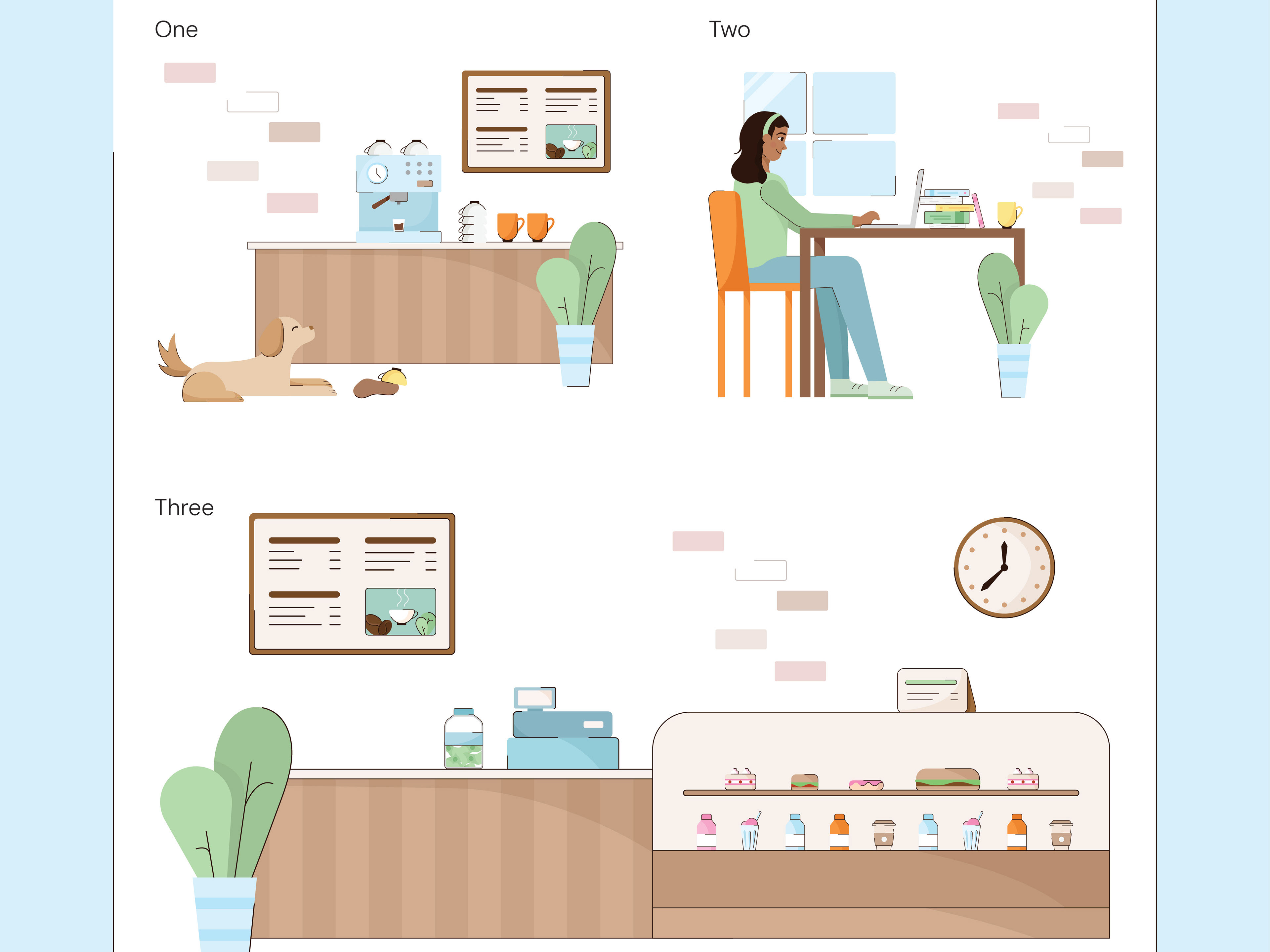
The build-out process started with one test file that included portraits of regular people. To fit Nuance's needs, I expanded this file to include variations of healthcare workers, like doctors, nurses, administration, surgeons, and more. Upon completing this file, what began with 14 portraits of regular people ended with over 60 variations of healthcare professionals.
It was during this first file that I also established a color palette including Nuance's official colors, as well as their tints and shades. These colors were used across the library for outfits and props to make sure that all of the files stayed consistent.
After I finished this first file, I continued to edit all of the other existing files and create many different variations for each, adding more diversity, more colors, different professions, etc.
Below is a snapshot of some of the variations I created, as well as a quick video showing how a file might work for a designer who wants to customize a scene.
Step 3: Catalogues and Roll-out
To make it easy for designers to locate illustrations, the final step of this project was creating catalogues for each category. These contain screenshots of all the artboards in a file, allowing designers to quickly browse and find the illustrations they need. Once they find one they'd like to use, they can click on the file name and download it directly.
Upon completing this project, Nuance now has access to over 320 new illustrations for their materials!
Project Insights
This project gave me a lot of time and experience in Adobe Illustrator, which I have always loved working in. I also gained a lot of organizational skills and learned how to best provide assets for team usage. It was super fun to complete all of these files, and I'm proud to have made such a big impact on their library!
In addition to the main projects I got to complete, the other marketing interns and I also had the opportunity to write a blog post outlining our experience with Nuance and what we found to be most beneficial. This blog post is available to read on What's Next, Nuance's blog site, here!
This was a fun and quick side-project that allowed me to experience the blog life-cycle and gain some copywriting skills.
My time with Nuance was very valuable. I got to explore many different areas of design like production design, digital design, web design, and spatial design. My projects taught me about independence, preparation, time management, and organization, and I also learned about collaboration between departments and how to effectively present design concepts to large groups effectively.
Nuance provided many networking and learning opportunities, like career panels with team leaders that gave us lots of great advice for our careers, deep dives into software and programs, a meeting with LinkedIn employees about how to make the most of our profiles, and so much more.
I was able to complete every goal I had going into my internship but was able to leave with even more than I initially thought. I'm so thankful for all of the doors that have opened and the connections that I've made. This internship was likely my last, and it gave me a realistic idea of what to expect as I continue my career after graduation.
I hope that I've made an impact on Nuance as well, and I hope to keep in touch with everyone I've met during my time!

